In the hands of artists, colors can tap into our deepest desires and alter our perceptions — or even the course of history. That is never more true than with the color blue. A history of the color blue in art reveals a hue deeply connected with changes in religion, technology and culture.
Let’s delve into the history of this color that has captured the imagination of artists for millennia.
The symbolism of blue across history
The elusive hue reveals itself at the edges of our world, at the farthest point of the horizon and the deepest stretches of the sea.
Artists have used the color blue to represent everyone from deities to peasants and everything from skies to sickness.
It’s a color you can’t touch: the sky and the sea are blue, but not really. This ethereal color has been used to signify everything from purity to liberty.
In religion, it is also the traditional color associated with Mary: Mother of God, Mother of Christ, the Madonna, and the Virgin Mary.
In politics, it evokes liberty. During the 18th and 19th century, blue embodied the principles of the French Revolution: liberty, equality, and fraternity. It’s no accident that blue figures prominently among the flags of 75 nations.
Across time, blue has been the color of earth itself. Blue is the color of the sea; it is the color of the sky. It is also the color of Earth when viewed from outer space.
Early Art History and the Absence of Blue
Ironically, for all its many meanings across time, blue is a color that rarely exists. Unlike its fellow primary colors, red and yellow, blue did not emerge plentifully from the earth for early humans.
Certainly, the sky and water are nominally blue – but even those much exalted blue eyes are a mirage. While brown eyes result from a pigment, blue eyes are caused by a lack of pigment.
Indeed, it is no coincidence that cave paintings use earth-based pigments to depict animals and humans in rich tones of red, brown, orange and yellow. Early artists could not grind up the blue of the sky or sea to create a color.
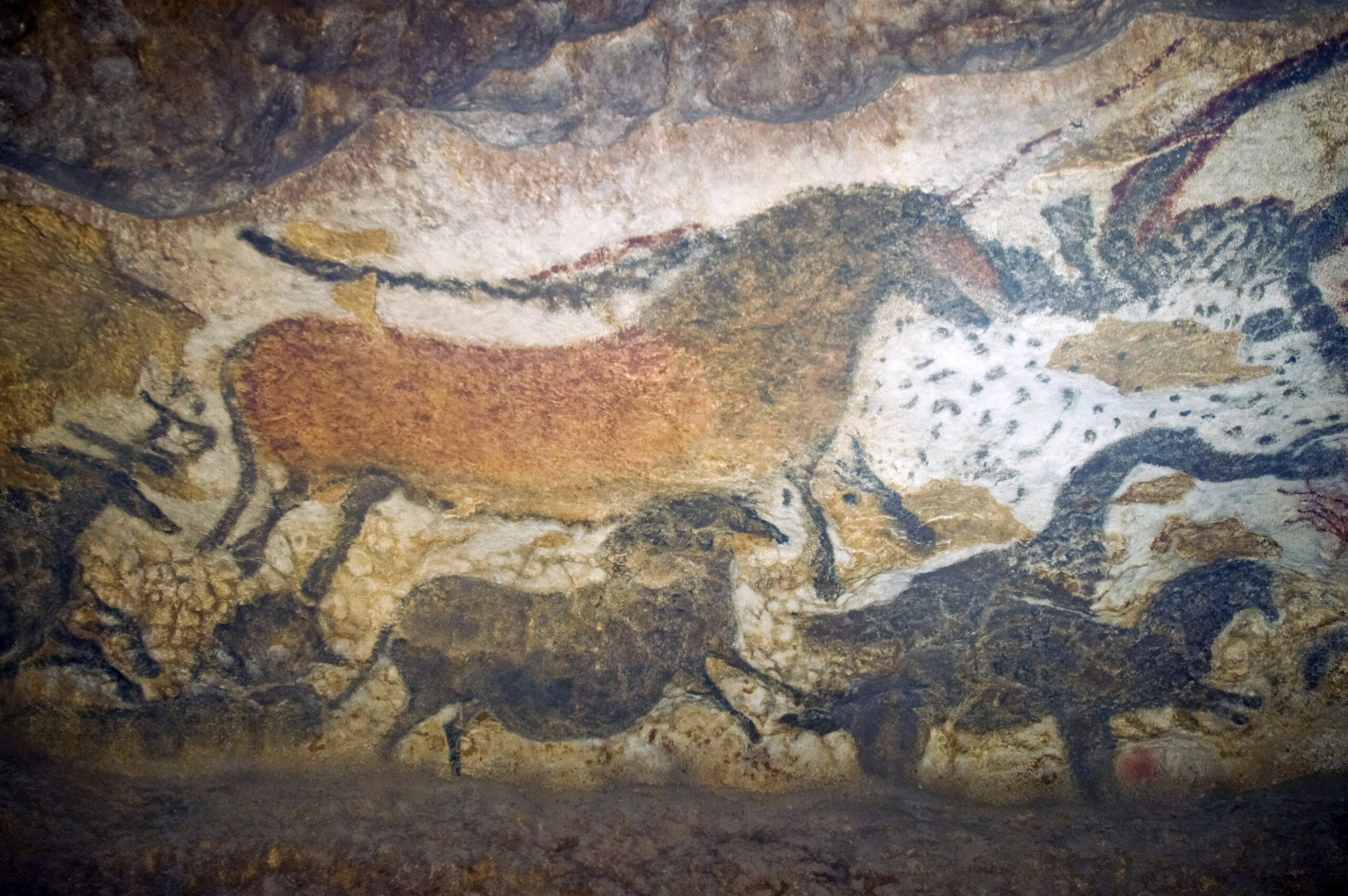
Heinz Berke, a chemist who studied the history of blue pigment, noted that humans “had no access to blue because blue is not what you call an earth color. You won’t find it in the soil.” Instead, blue could only enter art once humans developed the technology to mine hard-to-reach stones from the ground.
Where does blue pigment from?
We don’t often associate color with technology, but the history of the color blue is intimately connected with advances in science, engineering and chemistry. In fact, before the 19th century, and the advent of modern chemistry, only three natural blue pigments existed, each with its own hue and mode of production.
Lapis Lazuli: the first and most precious blue
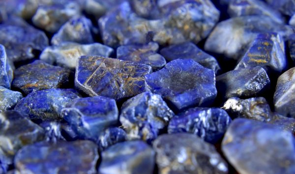
Blue made its first appearance on the art scene 6,000 years ago, with the early extraction of lapis lazuli in Afghanistan. For millennia, the mountains of the northeastern Baluchistan province remained the only source of this treasured and vibrant stone.
Its scarcity, geographical distance from many pre-modern population centers, and the danger of early mining efforts made it one of the most valuable resources on the planet for thousands of years. With early commerce along the Silk Road and other trade routes, lapis lazuli appeared in jewelry, statuary and seals found in China, India, Mesopotamia and as far west as Egypt.
Ultimately, the rarity of blue in nature made the color a luxury. So, across these many early civilizations, lapis came to be associated with divinity, wealth, power and purity.
Starting in the 6th century BCE, Afghan painters ground lapis lazuli into a fine powder used for a pigment in paintings. However, until the early medieval period, when ground lapis appeared in illuminated manuscripts and Italian frescoes as the pigment known as ultramarine, lapis was too precious to use in painting.
Egyptian blue: a deadly (but cheaper) recipe makes blue more common in art
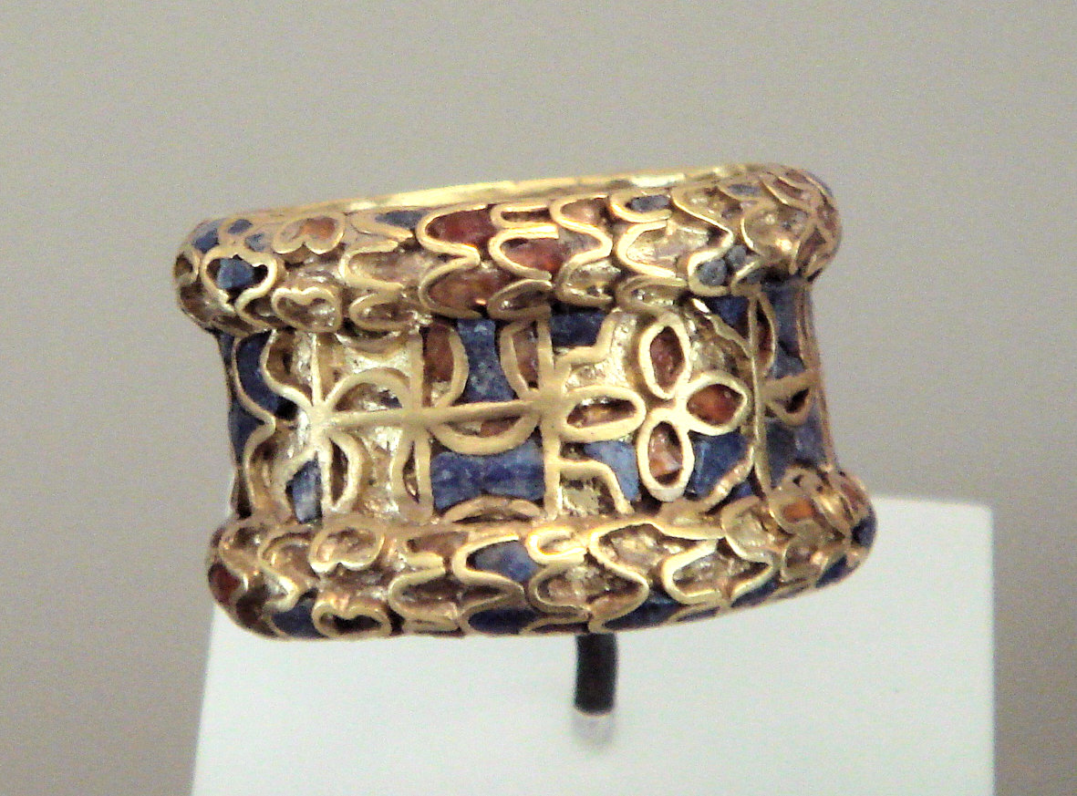
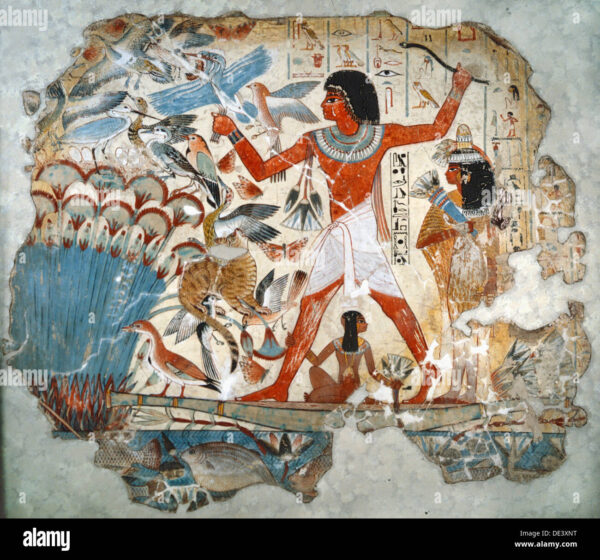
Invented in ancient Egypt more than 5,000 years ago, Egyptian blue is the oldest known synthetic pigment. In the ancient Egyptian language, its name meant artificial lapis lazuli — a testament to the popularity of this vivid blue and the human ingenuity that went into producing a cheaper, local alternative.
In ancient Egypt, blue represented the Nile and the sky, and was associated with divinity, power and fertility. It appeared in painting, sculpture and jewelry, on scarabs, papyrus and sarcophagi. Famously, the Egyptians also used the powdered blue pigment to create the dramatic eyeshadow that delivered a deadly lead poisoning.
Egyptian blue outlasted its civilization, and remained the prevailing blue pigment in the Roman Empire, where it was used in mosaics, ceramics, painting and glasswork. In fact, chemical analysis reveals that the original Egyptian recipe persisted into the early Middle Ages with little modification.
Unfortunately, the original recipe for Egyptian blue was lost to time. But modern chemists, who have since recreated the process, proclaimed it an extraordinary feat of early scientific experimentation.
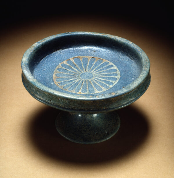
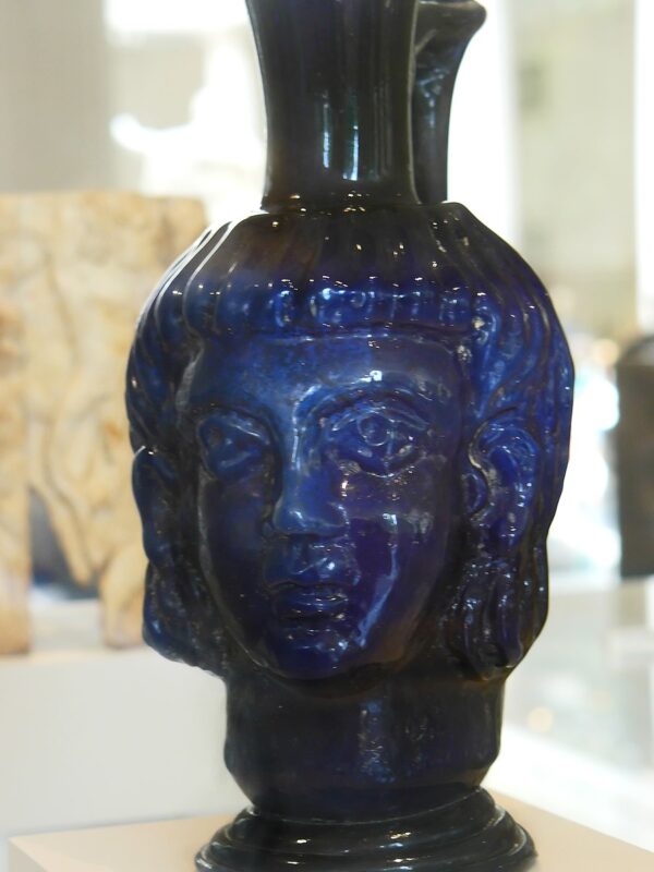
Egyptian blue recipe
- First, combine limestone and sand with a copper-containing mineral such as azurite or malachite
- Heat to 1470 and 1650 degrees Fahrenheit, and roll the mixture into small balls
- Remove the opaque blue glass known as grit and crush it into a fine pigment
- Mix with glues or tempera (egg) to create paints or ceramic glazes
Ultramarine: the divine blue of the Renaissance
Even as Egyptian and Roman gods gave way to the Christian church, the color blue continued its symbolic connection with power, purity and the sacred.
In the 4th century CE, the Christian church began associating colors with various saints. Unsurprisingly, the most precious and singular hue belonged to Mary, the one and only Mother of God.
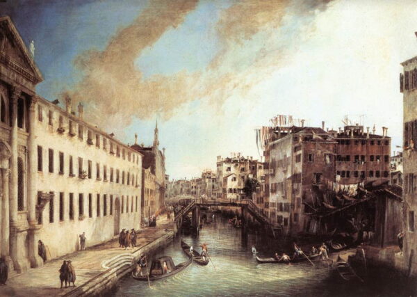
In subsequent centuries, as commercial routes matured, Italian traders brought lapis lazuli to Venice. Ground into a powder and combined with the egg-based tempera that formed the base of medieval paints, the precious blue stone transformed into the pigment that would shape the Renaissance.
Ultramarine, translated from the Latin “ultramarinus,” means beyond the sea. Indeed, lapis produced a luminous and otherworldly blue that made Egyptian blue appear wan and greenish in comparison. By the 14th century, it was the most sought-after shade in the western world, worth more than five times its weight in gold.
Ultramarine recipe
- Grind the stone in a mill
- Mix the fine particles with alcohol and use a magnetized channel to remove metallic impurities
- Knead the mixture with wax and water until it is brought together
- Strain through a fine cloth to ensure only the finest particles pass through the fabric to create high-quality pigment
Chemical blues: the marriage of art and industry
As with many things in the 18th and 19th century, industrialization brought many chemical and scientific advances.
Chemists turned their attention to pigments as early as the 18th century. In the early 1700s, Prussian Blue debuted in Germany as the first synthetic color since Egyptian blue. An alternative to indigo, which bled or faded, Prussian Blue quickly made its way across Europe. Within a few decades, it would grace the palettes of artists from Watteau to Hogarth.
Cobalt blue, created from aluminum oxide, and Cerulean Blue soon followed. Then, in 1826, scientists created a chemically-identical synthetic pigment to lapis lazuli.
The modern Ultramarine Blue was born. And with it, an era when affordable paints would democratize the use of blue in art.
From the holy to the melancholy: famous artists and their use of blue
As technology, religion, commerce and culture shaped and reshaped society, the symbolic meaning of blue changed. But its centrality to the work of many of history’s most noted artists did not.
Giotto: Blue as the Expression of the Sacred
Valued beyond gold, it is perhaps unsurprising that medieval and early Renaissance artists saved lapis lazuli and ultramarine for their most important subject: religion.
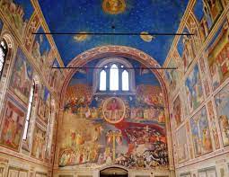
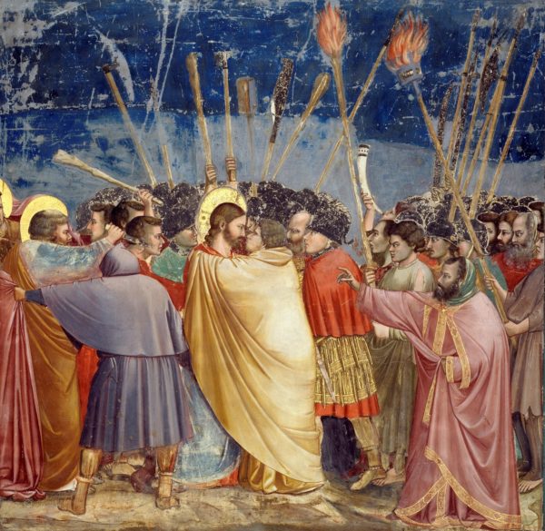
In 1303, Giotto became one of the first European artists to employ this exclusive color with the frescoes of the Scrovegni Chapel. While its walls detail the life of Christ, the ceiling beckons viewers into an expanse of deep ultramarine, dusted with gold stars.
For Giotto, heaven was blue. But even more so, ultramarine served a symbolic purpose. As Giotto himself said, “every painting is a voyage into a sacred harbor.” Indeed, to use the precious pigment so lavishly would have been an expression of the artist’s piety. Not to mention the church’s power and authority.
Blue is also the color of Mary’s cloak, which he contrasts with her traditional red robe in his Nativity fresco. Tellingly, in a fresco that depicts Mary before the birth of Christ, she wears only the red robe. It is only the mother of God who can wear the sacred blue, securing a connection between ultramarine and divine purity that would persist in western art through at least the Renaissance.

Titian Blue and the Emergence of a Secular Blue
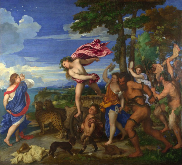
While the connection between blue and Christianity continued, Titian marks the beginning of a more humanistic use of blue.
On the one hand, blue is the primary color in Titian’s Assumption of the Virgin (1516-1518). As in Giotto’s rendering, blue is the color of Madonna’s cloak, wrapped gracefully around her and set off magnificently against her red robe as she is carried upward by the angels to Heaven.
On the other hand, in 1523 Titian liberated the color from the shackles of religion in Bacchus and Ariadne. By depicting an ordinary bystander draped in cloth of rich blue, he stripped the color of its conventional and hierarchical associations. Even more shocking, he presented the color of Christianity within a pagan scene celebrating the human body, pleasure and dissipation.
Vermeer and the quiet blue of domesticity
Other artists followed Titian’s example, freeing blue from its religious associations and bringing it into intimate, domestic settings.
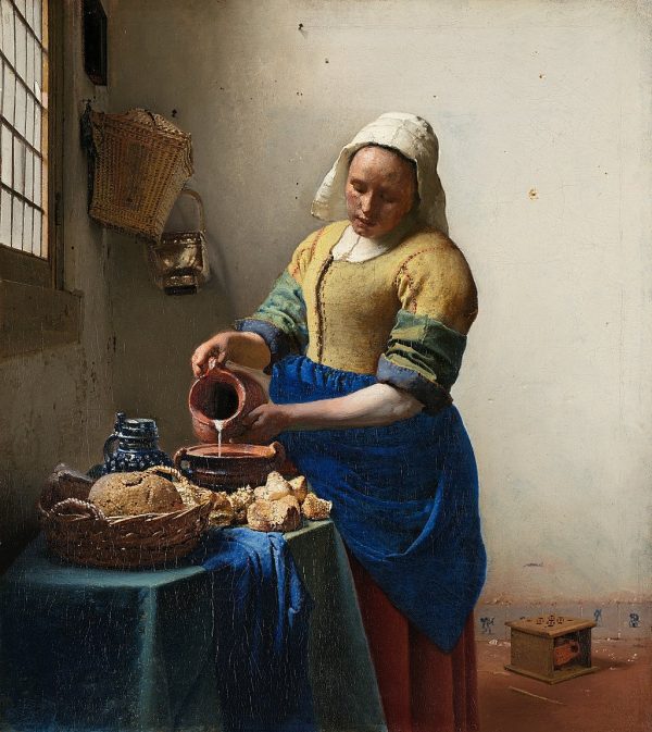
And while other artists used ultramarine sparingly, Johannes Vermeer positively bathed his paintings in the precious hue. In Girl with a Pearl Earring, his knowing subject wears a blue turban. Equally, it is the most striking of colors in The Milkmaid and Woman with a Water Jug.
Vermeer also combined ultramarine with other colors, including white and red, to produce the muted blues of a domestic home, the browns of wood beams, or even shadows falling across flesh.
From the pre-modern period through the Renaissance, blue represented power, wealth, the sacred and the unattainable. With his liberal use of ultramarine, Vermeer brought that same symbolic weight to the tranquil middle class life in his hometown of Delft. In that sense, his use of blue was positively revolutionary.
Vincent van Gogh – Starry Night
In 1814, a French chemist spotted the ultramarine pigment in a lime kiln. So began the era of new and cheaper chemical ultramarine.
Unlike Vermeer, who lavished his paintings with ultramarine to elevate their perceived value, the French Impressionists no longer had to wonder if they could recoup their investment in a blue-toned painting.
In fact, the color proved so popular with the Impressionists that the French public embraced it as a national treasury. The color’s name? French Ultramarine.
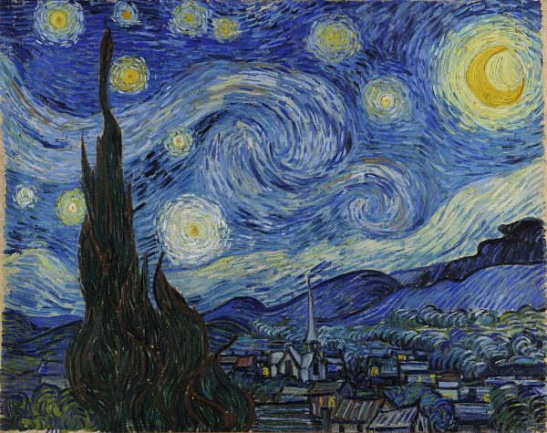
Vincent van Gogh used both French ultramarine and cobalt blue for his painting The Starry Night (1889). In fact, art historians have detected no fewer than 21 shades of blue in his masterpiece. And like Giotto, his subject is the night sky. But rather than a static and eternal heaven, Van Gogh uses blue to express movement, inner turmoil, with a sky constantly in motion between starlight and gloom.
Modern blues
As artists entered the 20th century, the symbolism and meanings of the color blue continued to evolve. But its emotional power, perhaps derived from its earliest history as a deity, continued.
Pablo Picasso: Melancholy of the Blue Period
As the centuries wore on, the focus of art shifted from the religious to the secular, but artists continued to be enchanted by the emotional power of blue. For Picasso, the death of his closest friend, Casagemas, catapulted his work into tones of murky greys and melancholy blues. From 1901–1904, he turned to outcasts as his subjects, using blue to transmute the pain and hardship of their everyday lives into something beautiful.
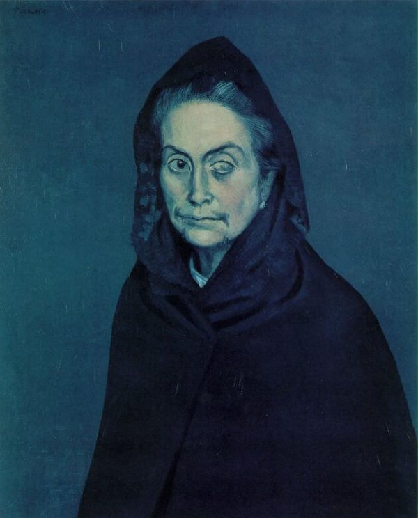
One only needs to look at the blue that awaits Edvard Munch’s lovers in Kiss by the Window to see how other artists used blue to express the psychological depths of human experience. The same blue haunts Van Gogh’s Starry Night and consumes the dream of Gauguin’s Sleeping Child.
Even the music associated with the color has a dark history. The Blues derives its name from hallucinations (“The Blue Devils”) linked to alcohol withdrawal. Even today, the Blues signals a state of agitation or depression.
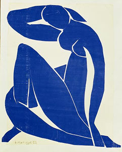
Henri Matisse: reclaiming the joy in blue
A certain blue penetrates your soul.
Henri Matisse
Matisse’s modernist Blue Nudes from his cut-out period in the 1950s offer a tremendous modern reinvention of the color blue. Matisse used blue to capture volume and perspective, an extraordinary challenge in light of the flatness of the lithograph medium. They are sublime renderings of the female form, all languid limbs, and fluid compositions, not that far removed from the beatific figures of the mother of Christianity. In that sense, they represent both a dramatic reimagining of and continuity with the Renaissance masters, and their use of seemingly three-dimensional blue drapery to create entirely lifelike Madonnas.
Yves Klein: the perfect blue
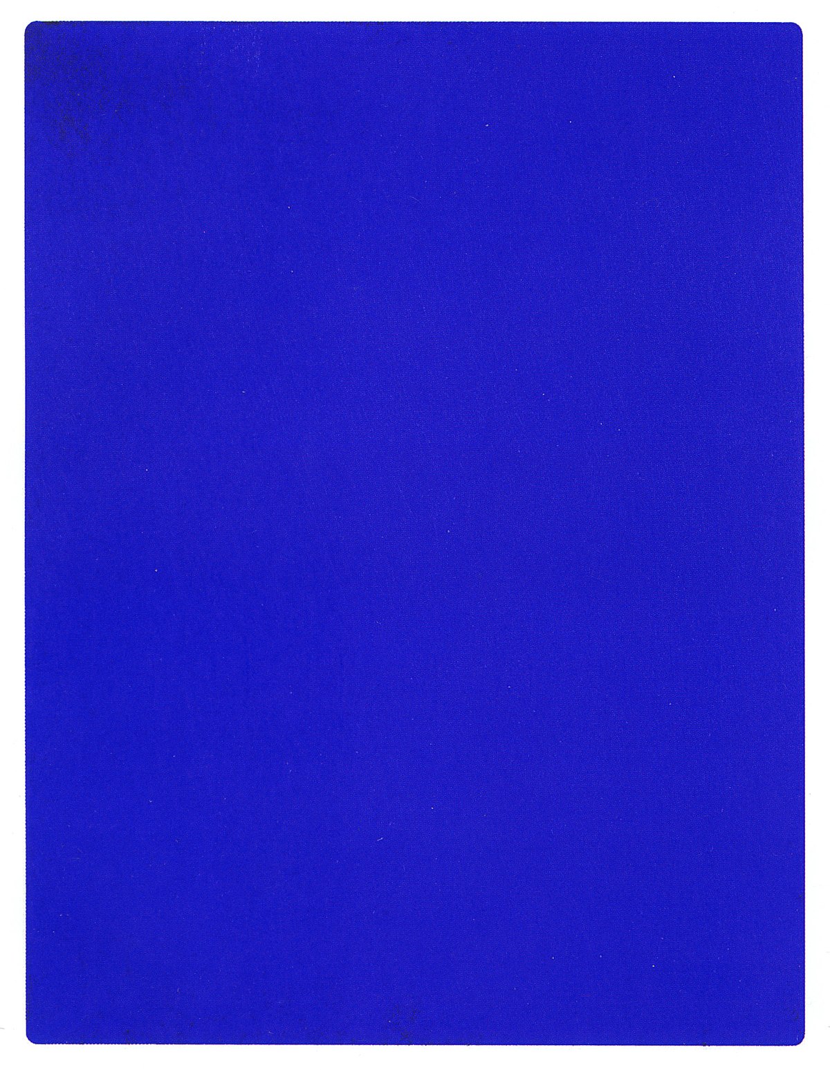
No mention of blue in art is complete without a nod to IKB (International Klein Blue). IKB, with its harmony of chemistry, art and the search for perfection, is a fitting end to the history of the color blue in art.
In the late 1950s, Yves Klein commissioned a master color maker to create the bluest blue of all: a pure blue. Its pigment is the deepest of blues with a light touch of inkiness. Its recipe is the culmination of the millennials, the history of the color, and the perfect place to end. His IKB paintings combine the heavy use of Ultramarine with a rich application of the paint itself. The mix uses a matte, synthetic resin binder which suspends the color and allows the pigment to maintain as much of its original qualities and intensity of color as possible.
IKB
No reproduction indeed does this astonishing color justice. This is a blue that truly does levitate from the wall. Klein’s blue paintings are also rich in texture, which doesn’t reproduce well in photographs or films.
The pinnacle of art as performance, Klein commissioned naked models to roll around in his blue paint. He would conduct a symphony with these human paintbrushes, producing a series of paintings he called Anthropometries. Without his manifesto which expresses his philosophy of color, we might not celebrate Yves Klein.
“The world is blue. Blue has no dimensions; it is beyond dimensions.”
Yves Klein
While blue may be one of the three primary colors, it is never simply blue but a kaleidoscopic spectrum of pigments, notes, and tones. It is the stuff of art: of painting and music. The color also surrounds us constantly in the oceans and the heavens.
Perhaps this is why it continues to hold such enduring appeal for artists today. It is a color that exists forever out of reach, just as the blue of the mountains cease to be blue once they meet. “Desire is full of endless distances,” observed the poet Robert Hass. Blue is the color of longing for a distance that can never be closed, the tantalizing promise of worlds beyond our own.
The most common blue paints for artists
- Prussian Blue
- Phthalocyanine
- Indanthrone
- French Ultramarine
- Blue Lake
- Cobalt Blue
- Cerulean Blue
Further reading:
- The Possibilities of White Paint and the 5 Artists Who Realized Them
- Advice on Getting the Colours Right in Your Painted Portraits
- A Brief History of the Color Red in Art
This article was originally published July 21, 2020.


