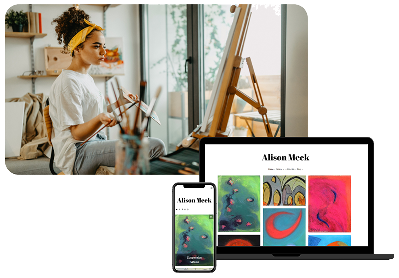
The best artist websites feel effortless. They put art front and center and give voice to the artist. The sales rep who never sleeps, a great artist website sells your art, communicates with your customers, promotes your exhibits and showcases your best work.
Every month, 500,000 people search for art online. Even if you make your money at art fairs or from a gallery or home studio, you need a way to share and sell your art online.
A stunning portfolio website could jumpstart your art career.
But you’re not a web developer, and frankly who has the time to learn? Hire a web designer? Sounds pricey.
Plus, an artist’s website is unlike any other. You need a visually-oriented homepage, gallery pages, and an artist statement. A one-size-fits-all website builder isn’t for artists.
The good news is you don’t have to train as a web designer, spend a fortune or settle for a lackluster website.
Over two decades, Artweb has helped more than 66,000 artists build professional art websites without the hassle or expense. With their feedback, we’ve discovered the 10 secret ingredients found in all the very best artist websites.
Read on to learn how you can build a professional art website that gives you visibility, showcases your portfolio and sells your art.
#1: A Website Builder Designed for Artists
Choosing the right platform for your website is one of the first and most critical decisions you’ll make in your art business. Choose wisely and you’ll enjoy an easy-to-build, affordable website that provides you a professional online presence. Or, choose poorly and you could find yourself with an expensive, time-consuming and clumsy patchwork that was never built with your needs in mind.
In truth, there are a lot of good options on the market. And one artist’s ideal website platform is another’s biggest headache. So, your first step should be to home in on your priorities. Ask yourself:
Budget
How much am I willing to spend on a monthly subscription?
DIY vs Hire a Web Designer
Do I have the time, patience and skill set to build my own artist website? Or the budget to hire a professional?
Functionality
What are my must-have features?
Flexibility vs Ease of Use
Am I willing to learn a complex website builder that lets me customize every aspect of my site? Or do I prefer a straightforward solution that provides me with ready-made templates?
Art Specialist vs General Website Builder
How important is it to work with a company that offers templates and customer service specifically for artists?
Artweb vs WordPress: What’s Best for Your Art Website?
In websites, as in life, every choice comes with a trade off. For example, WordPress is a terrific option for a tech-savvy artist who wants to customize every pixel on their website. The open-source website creation platform offers multiple “themes” that artists can customize to their style, or augment with plug-ins for e-commerce, email marketing and more. But with flexibility comes time, money, and regular upkeep.
In contrast, Artweb opts for an easy-to-use, low-maintenance and affordable solution. Our philosophy is that the best artist websites are about the art, not the bells and whistles. You’re an artist, not a web developer. So why anguish over font choices, layouts, or photo positioning? Instead, Artweb curates website templates specifically for artists. That means your website comes ready-made with gallery pages, an artist statement and the most trustworthy e-commerce tools.
Ultimately, to create your very best artist website, you’ll need to understand your priorities, budget and interests. Do you want to focus on your art? Or your website? To learn more about the pros and cons of your options, check out our guide to artist website builders.
#2: An Artist Brand that Tells Your Story
Georgia O’Keeffe
I found I could say things with color and shapes that I couldn’t say any other way.
If a picture is worth a thousand words, then an artist’s brand is like a book of illustrated short stories. And you cannot create a beautiful portfolio website without a powerful visual narrative.
Yes, branding feels like a dirty word, but bear with us. Like any small business owner, you need to ask yourself: “What is my Unique Selling Point?” But unlike your run-of-the-mill Main Street shop, your unique selling point shouldn’t be manufactured for a target audience, or dictated by the latest trend. It should be an authentic, genuine mission that comes from the art you make, rather than the other way around.
Let’s consider the three elements of an artist brand that the best artists websites use so effectively:
Color
With your color scheme, you wordlessly convey your values and style as an artist. Primary colors feel dynamic, while neutral tones feel soothing. On your homepage, where visitors rarely linger for more than a minute, the efficiency of color is paramount.
Font
Your primary font should be simple, and make text easy to read. Avoid serif fonts – their curlicues are less mobile-friendly and present challenges for visually-impaired readers.
But that’s not to say your font shouldn’t have personality. Whimsical or somber, modern or traditional, your font makes a subtle statement about you as an artist.
Logo

Your logo is the symbol that tells visitors: you’re in the right place.
When it comes to the best artist websites, a logo provides consistency and reassurance between pages and across marketing channels.
It telegraphs the artist’s personality, medium and color scheme. Moreover, it may be the first thing art lovers notice when they arrive at your site.

Fortunately, you don’t need a marketing budget to create a timeless, eye-catching logo. Nike famously paid a student $35 for one of the most recognizable emblems on the planet.
Today, graphic design websites offer free templates awaiting your inspiration.
#3: A Memorable Domain Name
What’s in a name? More than the Internet equivalent of a street address, your domain name serves as another extension of your artist brand.
Indeed, the best artist websites boast a domain name that introduces the artist, explains the medium and boosts visibility in search engines.
With nearly 2 billion websites in the world, it’s not always easy to claim your preferred domain name. While a combination of first and last name remains the gold standard for artist websites, few people have a name so unique that this option remains open.
Instead, you can get creative and incorporate other keywords into your url. But remember that a domain will dictate how Google and other search engines find your website. A descriptive, but straightforward name that incorporates some version of your name, the words art or artist, your medium, or your location will increase your online visibility.
Great Domain Names from Artweb Artists
When your trusted “First Name Last Name” combination isn’t available, get inspired by these resourceful artists:
Add a keyword like “art” or “artist”
www.lelaaltmanart.com
Use an alternative domain extension
“.art” is an increasingly popular and credible alternative, especially when .com isn’t available: www.lindabristow.art
Include local flair
Add your hometown, region or neighborhood. For artists with a storefront or gallery, or those who sell art inspired by a place, using a url with geographical connections boosts your visibility in search engines. www.brightonartist.com
Use the Artweb domain (for FREE)
If you want to avoid the hassle and expense of buying a domain, Artweb provides members with a hosted domain for free: www.marydrummond.artweb.com
Describe your medium
www.michaelsgraphicdesigns.artweb.com
Use humor
www.artinthedoghouse.co.uk
#4: A Stunning Homepage
An artist homepage is your shop window. Just like an eye-catching display that turns window shoppers into buyers, your homepage should make the casual browser stop and think “WOW!”
On average, a visitor leaves a website after less than a minute. But the most successful art websites treat their homepage as a welcome mat, enticing visitors to browse their collection and guiding them to gallery pages, the about the artist page, and ultimately to the online store or contact page.
So what are the ingredients of a great homepage?
- Stunning images of your art
- A captivating (but brief) headline
- A homepage menu with clear directions through the site
- A Call to Action button that attracts visitors to make a purchase or get in touch
- Testimonials
#5: Professional Photographs of Your Art
Did you know that nearly 20% of art sales now happen online? What that means is without high-quality photos of your art, you may be left behind.
Bad photos means fewer sales. Limited opportunities for licensing deals and reproductions. Unhappy customers and costly returns.
That’s why beautiful photos take center stage in all the best artist websites. Fortunately, it’s easy to DIY your way to stunning professional-grade photos of your art.
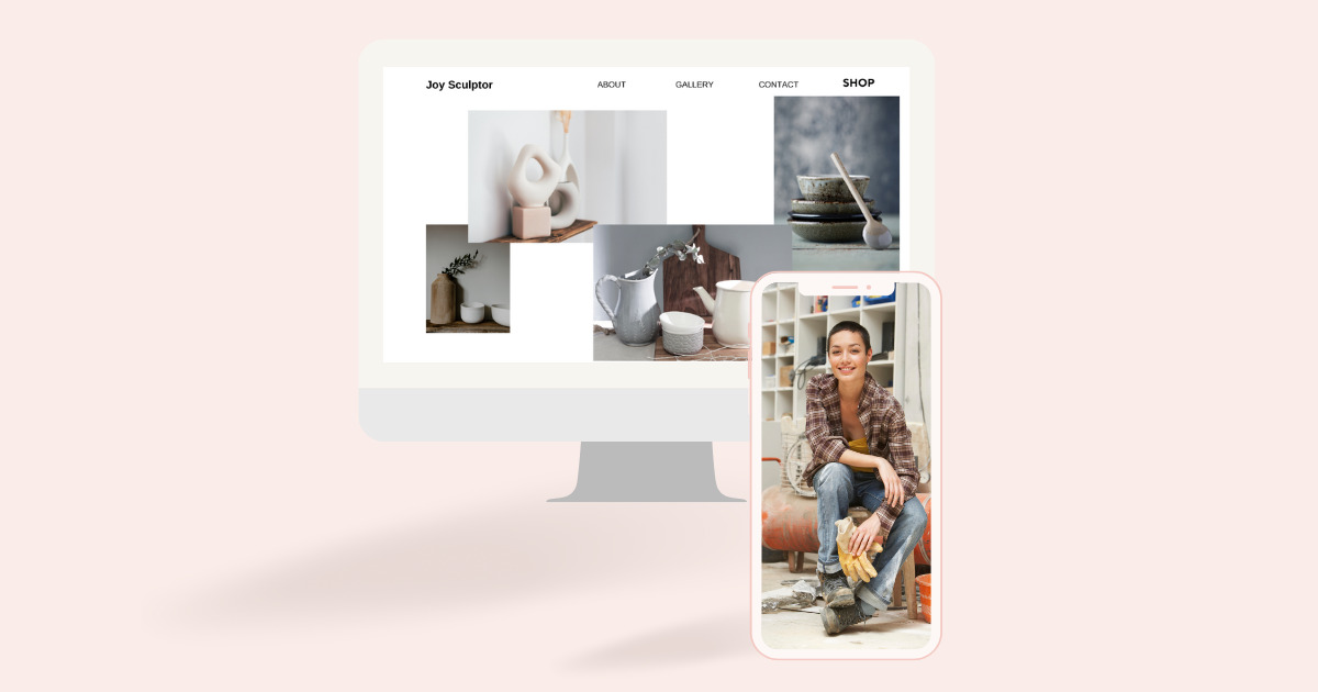
Take photos or scan your art
First, check our guide to photograph your artwork. It’s the collective wisdom of 66,000 (and counting) artists on a budget, who’ve shared their tips for taking million dollar photos on a penny-pinching budget. We also have specific guides for taking photos of sculpture, or photographing jewelry.
Did you know you may not even need a photoshoot? For some types of work, such as printmaking or collage, detail and texture are everything. In those cases, you’ll want to scan your images instead. Here’s our tips for scanning your work (even if it’s bigger than your scanner)!
Optimize images for the web
Once you’ve taken your photos, you’ll need to save them in the right format, adjust lighting and crop them to remove any unnecessary props (like your hand!). Our guide to optimizing your images for the web will help you produce pixel-perfect photos every time.
Upload to your artist website and build a gallery
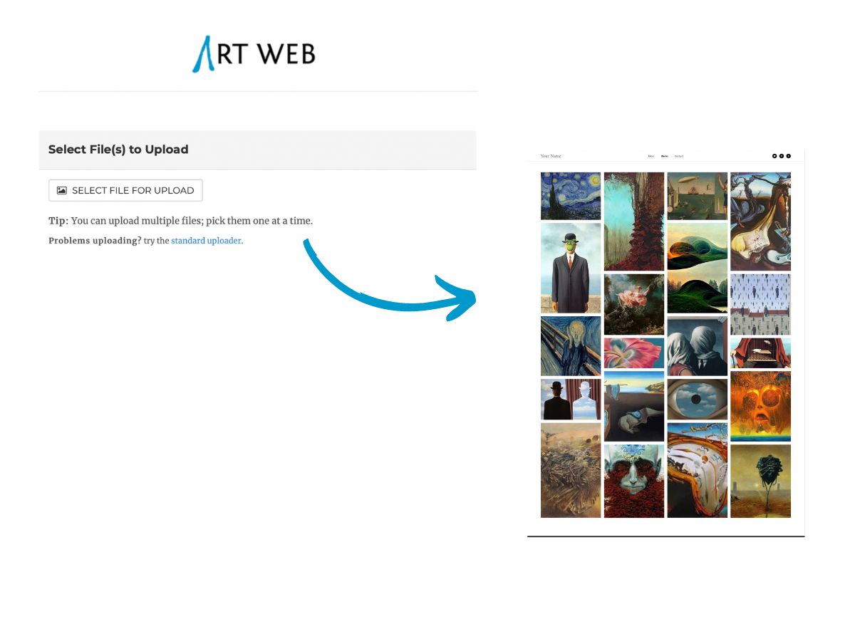
At last, the easy part! With Artweb, you simply upload your photos and your gallery templates do the rest.
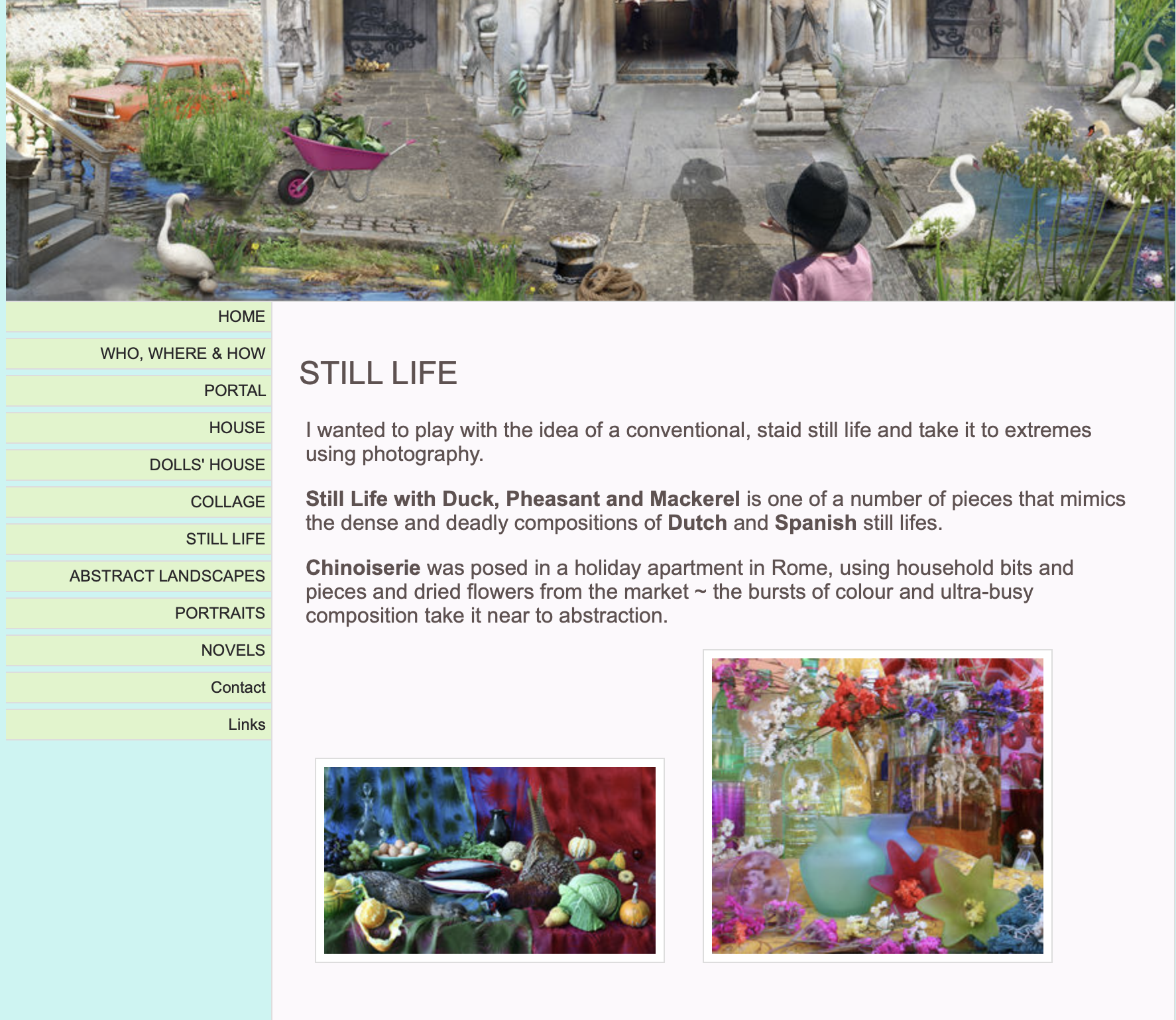
#6: Gallery Pages that Organize Your Art
Presentation is everything. While high-quality images of your art are a must, you also need to showcase your work as if you were building an exhibit.

Create separate pages for each genre or medium. Or, build a page for past exhibits. If you’re hoping to secure commissions, grouping your catalog into distinct pages of no more than a dozen artworks will make it easy for visitors to find art that interests them.
#7: A Compelling About the Artist Page
Art fans aren’t just buying your work. They’re interested in your story, your process and your inspiration. Treat your About the Artist page as an afterthought and you risk losing views or sales.
Fortunately, you don’t have to be a great writer to craft a winning biography or artist statement.
Check out our comprehensive guide to writing an artist statement and our tips for a standout About the Artist page. Learn how to:
- Describe your art with language that makes a great first impression.
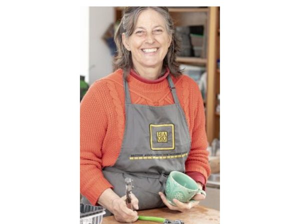
- Welcome them inside your studio with a candid photo that charms your buyers.
- Showcase your achievements with a bio and resume that sells you AND your work.
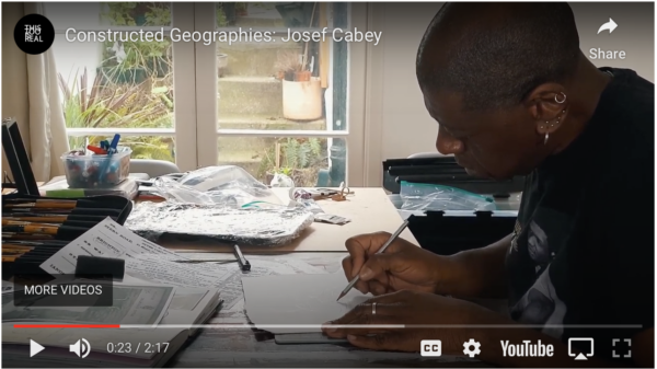
Still need inspiration? Grab some tricks from these successful Artweb members.
#8: An Online Store to Sell Your Art
Wouldn’t it be nice if every day was a peak art sales day? But your time is scarce. You’re limited by geography. There are only so many exhibits, fairs and art nights you can realistically join.
But an online store is the secret e-commerce weapon that gives you an edge over other artists.
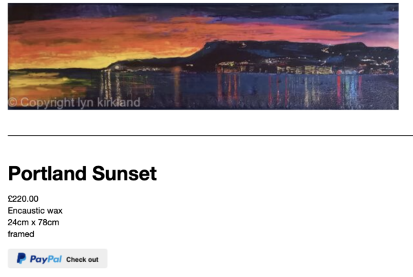
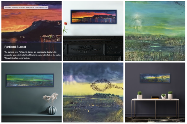
Many website builders offer some form of online payment system. But the best artist websites sell more art precisely because they use a solution built specifically for artists. For example, Artweb offers an easy-to-use online store that serves the needs of both art buyers and sellers:
Zero Commission
Cut out the middleman and spare yourself hefty gallery fees.
Easy, trustworthy payment
Secure credit card and PayPal options give you and your customers peace of mind.
Sell to a global market
Price your art in multiple currencies, offer shipping options and give them secure delivery wherever they call home.
#9: SEO that Gets Your Art Found on Search Engines
Every month, 500,000 people search for art online.
So how can you grab a share of that traffic? Better yet, how can you do it without spending a fortune on ads?
The answer is search engine optimization. Or, put simply, how to get found on Google or other search engines.
Marketing pros will promise to rocket you straight to the top of search results with a brew of web hacks that will cost you thousands of dollars per month. And maybe, a year from now you’ll see the first hints of progress.
The truth is that a fancy traffic-boosting campaign might work. But it requires an unbelievable investment of time, money and expertise. And at the end of the journey? There’s still no guarantee of being found.
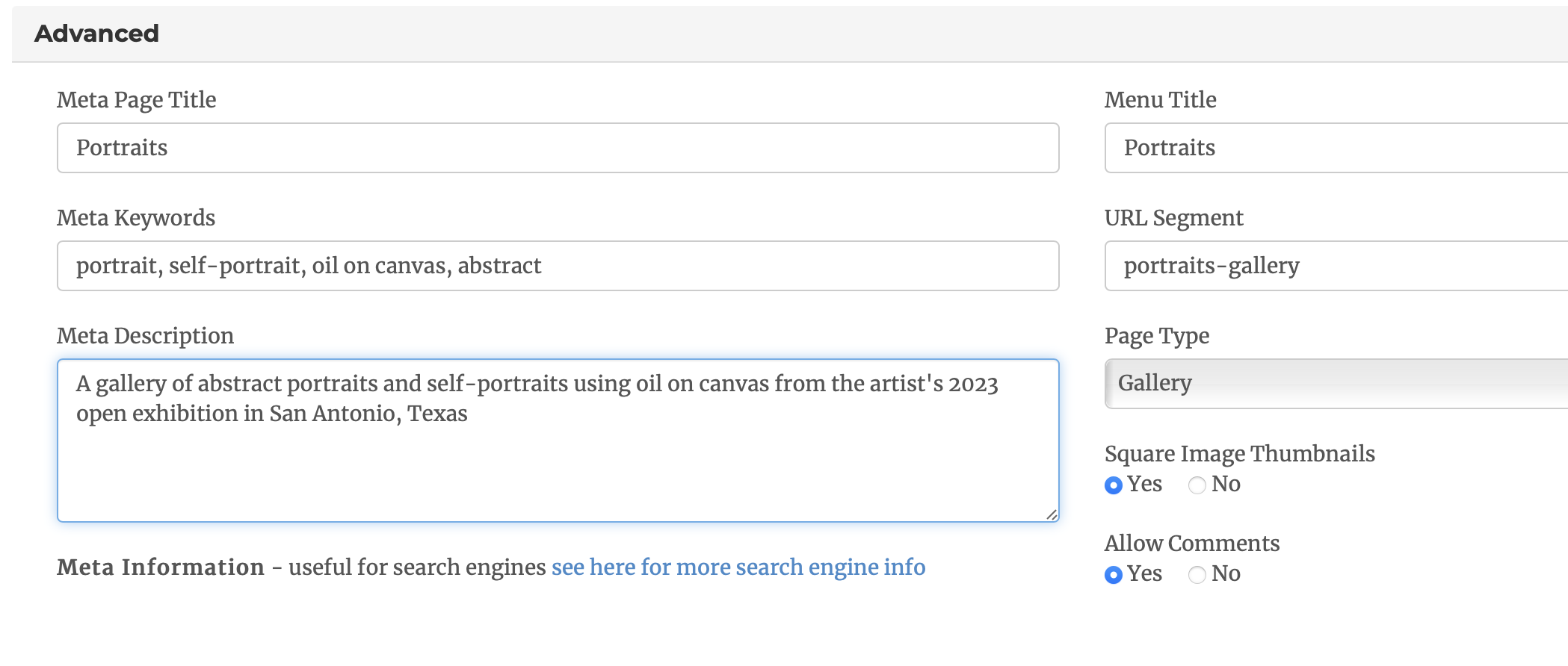
Instead, the smartest artists spend time on their art, and leave the technical details of search engines to their website builder.
That’s why we designed our website platform with built-in search engine optimization functions. The goal is a website experience that is easy, fast and affordable but still gets you the viewership you deserve.
Make sure your website builder offers you the worry-free formatting to ensure each page of your website is visible to search engines:
Fast Loading
Visitors abandon a slow-loading site, and search engines favor sites that load quickly. Artweb makes sure your website loads quickly, no matter how many photos you post.
Optimized Viewing
Your website automatically displays the best layout, whether on desktop, laptop or phone. No need to worry about formatting it for multiple devices.
Less Technical Worry
As you design pages, Artweb automatically converts your content into the language of search engines.
The result? Your artist site gets displayed in web searches to the right audience at the right time.
Looking for more tips? Read our guide for easy search engine optimization. Or, check out more tips for driving traffic to your website.
#10: A Contact the Artist Page
Did you know that 90 percent of visitors to your website will leave, never to return? That’s a lot of missed opportunities to sell your art. Enter the artist contact page.
An often neglected backwater, the best artist websites transform this humble workhorse into an essential part of their online marketing machine.
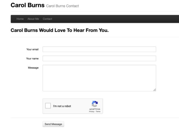
Checklist for your Artist Contact Page
A Contact Form
Include fields for name, email and a message box. Set up messages to be delivered to your email for speedy response.
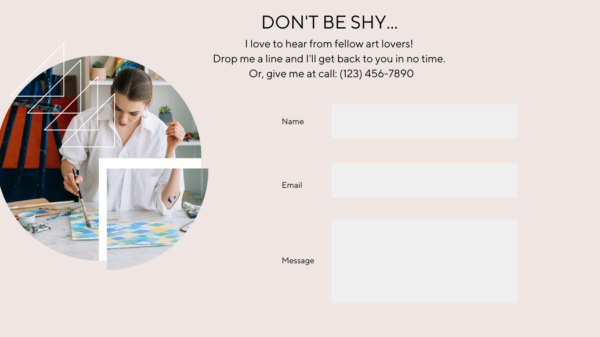
An Image with Personality
Add an image that tells the story of you, your art or the action you want the visitor to take.
Multiple Ways to Get in Touch
Make it easy for visitors to contact you using their preferred medium. Include social media feeds and a subscribe button for your newsletter. If you have a store, exhibit at a gallery or sell at a regular art fair, include the address and hours of operation.
Creating a Beautiful Artist Website Doesn’t Have to Be Hard
If you follow these simple steps, you can DIY your way to a portfolio website that captures your artistic vision and helps you sell your art.
And, if you’re wondering how to build your very own artist’s website without the stress or expense, consider building a free website with Artweb.


