The color of danger, scarlet passions, power and prestige — red has commanded the attention of artists for centuries. From the Paleolithic period to the contemporary, this archetypal color has been utilized by artists to access the extremes of human experience. Red is blood, lust and rage, beginnings and violent ends. The color of love and the color of shame, it is the first true color humans perceive after black and white. Continuing our series on color in art, ArtWeb explores the rich history of red, from Romans to Rothko.
Shades of red
Ochre red, and its prehistoric origins

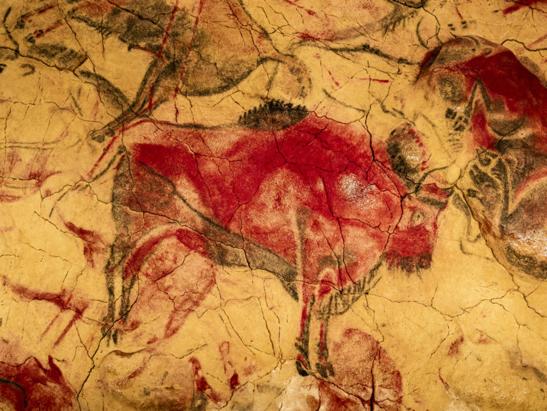
A naturally occurring clay pigment, red ochre takes its reddish color from the mineral hematite. The Neanderthals began using the color as far back as 250,000 years ago to decorate their bodies. In the Neolithic era, the pigment was used symbolically in ritual burial contexts, representing a return to earth or possibly rebirth. In art, the earliest uses of red ochre pigment can be traced back to the Upper Paleolithic Period, as seen in the red bison cave paintings of Altamira, Spain, dated between 16,500 and 15,000 BCE.
Victorious vermillion
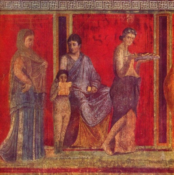
Defining 15 different shades of the color, red was very much en vogue among the ancient Romans. Used in frescoes that adorned the walls of their villas, the brilliant red of vermillion was a particular favorite. Yet, obtaining the color was a death sentence for those extracting it from the mines of Almaden, Spain. Natural vermillion, derived from the mineral cinnabar, is an incredibly toxic mercuric sulfide. Because of the purity of the substance, and the danger in acquiring it, the pigment became immensely expensive, ten times the price of red ochre. It was used to smear the faces of victorious gladiators, and can still be seen today in the remaining murals that grace what were once upper-class homes of Pompeii.
Synthetic shades of scarlet
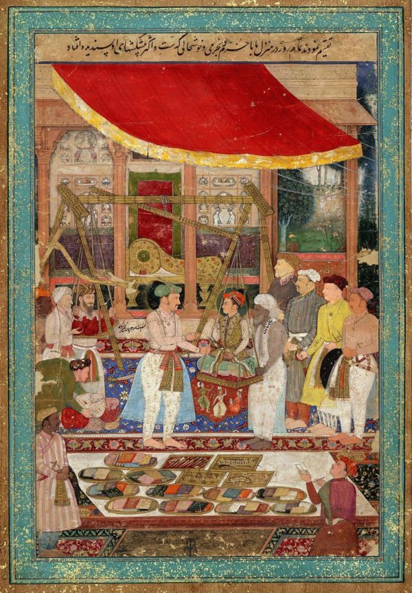
Synthetic alternatives began to appear as early as the 12th century, and by the 15th century a new red began to take hold. Carmine, with it’s deep crimson overtures can be seen among the palettes of Rembrandt, Vermeer, Rubens and Velazquez. Made from cochineal bugs, when dried and crushed they produced a vivid red hue. Other popular synthetic pigments such as minium (“red lead”) became prominent with Mughal artists from India and Persia in the 17th and 18th centuries, whose paintings were nicknamed “miniatures” after the heavily featured minium in their works.
Popular red hues
- Vermillion
- Red ochre
- Cadmium red, including its deep and light versions
- Alizarin crimson
- Scarlet
- Pyrrole
- Venetian Red
Red flags
With the advent of the Protestant Reformation, the popularity of red began to decline due to its associations with immorality, sin, and the excesses of the Catholic Church. It gained new popularity amid the French Revolution, where the color came to be associated with freedom and liberty. In the 19th to 20th century, red was taken up by political regimes and revolutionaries around the world, from China to Cuba.
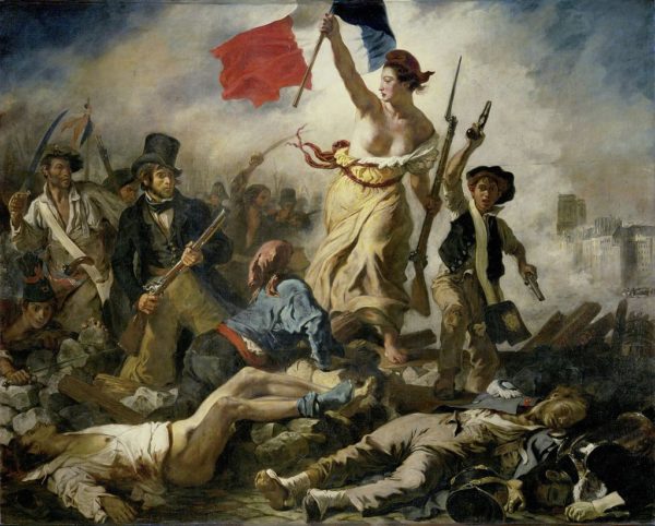
Notably, red was prioritized in Constructivist works, an avant-garde movement that emerged alongside the Bolshevik Revolution. Today, red in political art continues to act as a synonym for socialism, communism, extremism and revolution.
Holy red in medieval and Renaissance art
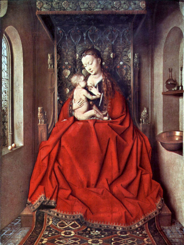
Red has played an especially important role in the Catholic Church. Symbolic of the blood of Christ within Christian iconography, it was adopted by cardinals in 1244. Their red hats and robes mark their readiness to shed blood for the Church. The Madonna, typically portrayed in blue by Italian painters, was depicted in red by the Flemish masters, who reserved the colour for sacred figures due to the exclusivity of the cochineal dye in textiles.
Jan van Eyck
In Jan van Eyck’s Lucca Madonna, the impressive red drapery comes to symbolize the passion and martyrdom of Christ.
Caravaggio
Caravaggio’s Saint Jerome Writing is a masterclass in color. We discern all elements in the painting, as Caravaggio intended: the books, the quill, the skull, the table, the white of Saint Jerome’s beard and flesh, the white of the tablecloth, and his halo.
But the dominant color in this painting is red — created using the red ochre pigment available at the time. The red of that magnificent robe that spirals around the seated and studious figure of Saint Jerome creates movement. At any minute he could get up from his desk and move out of the painting.
The robe is an architectural wonder, punching out at the viewer and drawing us to the center. It also connects and contrasts nicely with the slower tempo of the light reds within Saint Jerome’s face and hands.

Caravaggio and chiaroscuro
Caravaggio is the artist we most associate with the concept of chiaroscuro (Italian for light-dark). He starts in the dark and then paints in the light, creating a cinematically dramatic image.
In using this method, Caravaggio’s colors resonate with a greater depth than those made with the flatter light of earlier Renaissance paintings. Deeper colors recede to create a greater depth and darker colors help to enhance the drama of the scene. Using a limited palette available at the time makes his skill at delineating the colors even more impressive.
A red for the 20th century: cadmium
Henri Matisse: modern reds
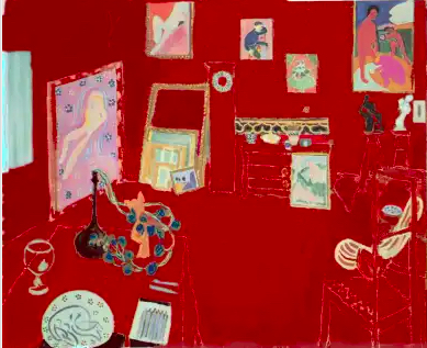
In 1910, cadmium red became available as a commercial product. Henri Matisse was the first prominent artist to champion the pigment in works such as The Dessert: Harmony in Red and The Red Studio. His red figures in Music reveal their contradictory nature — at once simple and evocatively charged. After all, red is a colour that exists at both ends of the spectrum of experience. The consistent, uniform tone of red, covering the entire expanse of the canvas, places our eyes within a harmony of space, but it also pushes and pulls our vision in its pulsating wake.
His use of this color was to purposely flatten what we know to be a three-dimensional space — a room. Its strength comes in the way the furniture could at any moment fall out of the frame. Simple line drawings delineate the furniture within the studio. The paintings hanging and leaning against the walls and the various objects on display give the painting an overall depth of space, as their bright and starry colors contrast heavily with the enveloping rouge.
Aleksandr Rodchenko: red and the “death” of painting
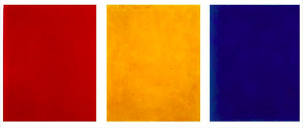
Red is part of Russian artist and polymath Aleksandr Rodchenko’s monochrome paintings. Rodchenko proclaimed the death of painting in 1921. He created three simple square paintings, one red, one yellow and one blue. The paintings were meant to signal the end to painting by distilling painting down to the three primary colors. It is a theory that was picked up by Abstract Expressionists that followed in the United States in the 1950s who used all-black paintings to signify the end of art.
“I reduced painting to its logical conclusion and exhibited three canvases: red, blue and yellow. I affirmed: It’s all over.”
Aleksandr Rodchenko
Politics of red
Rodchenko was a Communist, and perhaps the act of painting was too decadent for him. By the 20th century, the color had developed wide universal meanings traversing the extremes of authority, power and great wealth; both communism and fascism employed red to reflect their values.
Mark Rothko: A darker red
Another artist who famously dabbled in the psychological depths of red was Mark Rothko, whose abstract paintings of wine reds and blacks are reminiscent of blurred doorways or portals.
Rothko — most commonly associated with an array of sunburst colors: yellows, oranges, pinks, purples, a veritable tie-dye of color selections — created his most significant commission, the Seagram murals. Completed for the Four Seasons restaurant in New York, these large wall murals were composed of a dark, somber reds, browns, and black, unlike much of Rothko’s earlier works.
The Seagram murals never found their way to the Four Seasons and were instead bequeathed to the Tate Gallery in London. They now hang permanently in their own space inside Tate Modern. The reds flush through these giant works of pure art, capturing our emotions, feelings, and sensations.
Why are Rothko’s Seagram murals so dark?
Unlike many of his yellow, orange and cadmium red paintings, the Seagram murals are a dark, murky red. In 1959, Rothko visited Pompeii’s Villa of the Mysteries and felt a “deep affinity” to the “broad expanses of somber color” that haunt the frescoed walls. These reds were darker and dirtier than the clean, bright synthetic cadmium reds available to 20th century artists. His work attests to red’s unique communicative power.
Sometimes the reds levitate from the canvas, and sometimes, they recede, eliciting a part-spiritual and part-hallucinogenic feeling sitting among these paintings.
A final word on the use of red in art
Having dominated the visual realm for centuries, today, red has been surpassed by green and blue as the West’s favorite color. However, there is still one place where it’s mercurial pull still holds: the art market. With red artworks fetching the highest price at auction, what does it say about the color’s capacity to elicit the strongest human emotions? The French artist Louise Bourgeois once said: “Color is stronger than language. It’s a subliminal communication.” Red is an extroverted presence that beckons, demands attention, and at the same time, draws us inward, toward ourselves. In the words of contemporary artist Anish Kapoor: “It’s the colour of the interior of our bodies. Red is the centre.”
Discover more colors with the history of the color blue and yellow.

