Did you know that 90 percent of visitors to your website will leave, never to return? That’s a lot of missed opportunities to sell your art. Enter the artist contact page.
An often neglected backwater of an artist’s website, the Contact Me page starts life as a basic black-and-white form. But this humble workhorse should be an essential part of your website’s marketing machine.
Let’s explore how you can transform this unassuming page into an inspiration for conversations with potential customers.
What is an Artist Contact Me page?
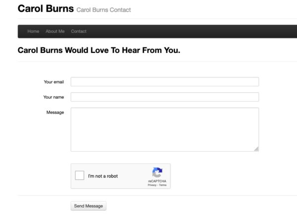
Along with privacy notices and data protection, the contact me page is a staple of most basic website templates. It contains a form that allows visitors to enter basic information: name, email and space to ask a question. At its most basic, a Contact Me form enables visitors to your site to get in touch. But it can do so much more.
Where does the contact me form go?
It should go to your email inbox. In your website settings, you can choose where and how often. Ideally, you should opt for instant alerts, as anyone who takes the time to fill out a contact form is serious about getting in touch and buying your art.
Why not just put my email address on my website?
You may wonder why bother with a Contact Me form at all, when you could simply share your personal email online. It’s one thing for a company with dozens or hundreds of employees to offer a contact form — after all, the website may receive hundreds of inquiries daily, with different employees monitoring it around the clock.
Unfortunately, a lot of bad actors use bots to troll websites for email addresses. If you do post your email on your website, you may find yourself with an inbox full of spam, phishing emails or viruses. So, even as a solo artist, it’s wise to create a contact page.
Alternatively, if you feel strongly about putting your email online, there are two ways to trick the bots:
- Spell out your email address: your name at your domain dot com.
- Hide your email address in an image rather than writing it in plain text.
Ultimately, an artist contact form simply looks more professional and minimizes spam and frivolous emails.
Replying to your messages
Consider that, on an average artist website, fewer than 5 percent of visitors will take the step of filling out a form. That makes every form submission on your contact page precious.
So, even if your would-be customer is slow to respond, basic customer service demands a quick reply on your part. Have a standard reply ready to respond immediately and give an idea of how long it will take to answer fully.
Even better, set your website to deliver an automated message as soon as someone completes a form. A brief message letting them know their message has been delivered or when they can expect a response is sufficient.
In Artweb’s website builder, a message automatically appears to reassure visitors that their message has been sent.

At the same time, Artweb delivers the message to your email inbox and alerts you in your Artweb portal that you have a new message. That way, you never need to worry that you’ll miss a message from a promising client.

Examples of Artist Contact Pages that Convert
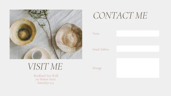
Don’t let the pro forma email submission form fool you. There’s a lot you can do to personalize your Contact Me page, depending on your goals and the nature of your art business.
Define Your Goal: Who do you want to fill out a submission form?
Let the motivations of your ideal customer guide the images, text and headlines you use on your contact page. In fact, while your long-term goal is, of course, selling more art, there are many more reasons you might want a visitor to contact you:
- Custom commission
- Invitation to speak at an event, host a workshop or interview request
- Questions about your art (size, medium, technique)
- Discover locations where you sell your art in-person (at regular art fairs, at a boutique or an exhibit)
- Call you
Let’s look at how your goals can inspire the composition of your artist contact page.
Do custom commissions drive your art business?
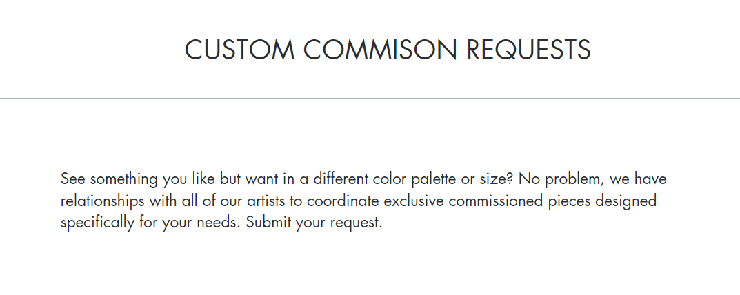
If so, make sure you ask the client for their specifications (size, color, medium, etc.). With commissions, you will undoubtedly go back and forth several times to ensure you understand the customer’s needs. So consider the contact form a starting point.
Are you looking for publicity or events?
If you have a unique perspective, story or talent of interest to the media or other public groups, make sure your contact form clarifies your availability and interest.

Is it easy to buy art directly from your website?
First, the goal is to make it as easy as possible for people to buy your art. If you don’t already have an online store, you might consider setting one up. For example, with Artweb, you can set up a page to take credit card and Paypal payments and set up your e-commerce store with just a few clicks.
If you don’t have an online store, you’re likely to receive more inquiries. At a minimum, make sure the gallery pages of your website include detailed information about each work (size, medium, framed or unframed, etc.) so that, when visitors do contact you to start the purchase process, they can be assured your piece is the right fit for them.
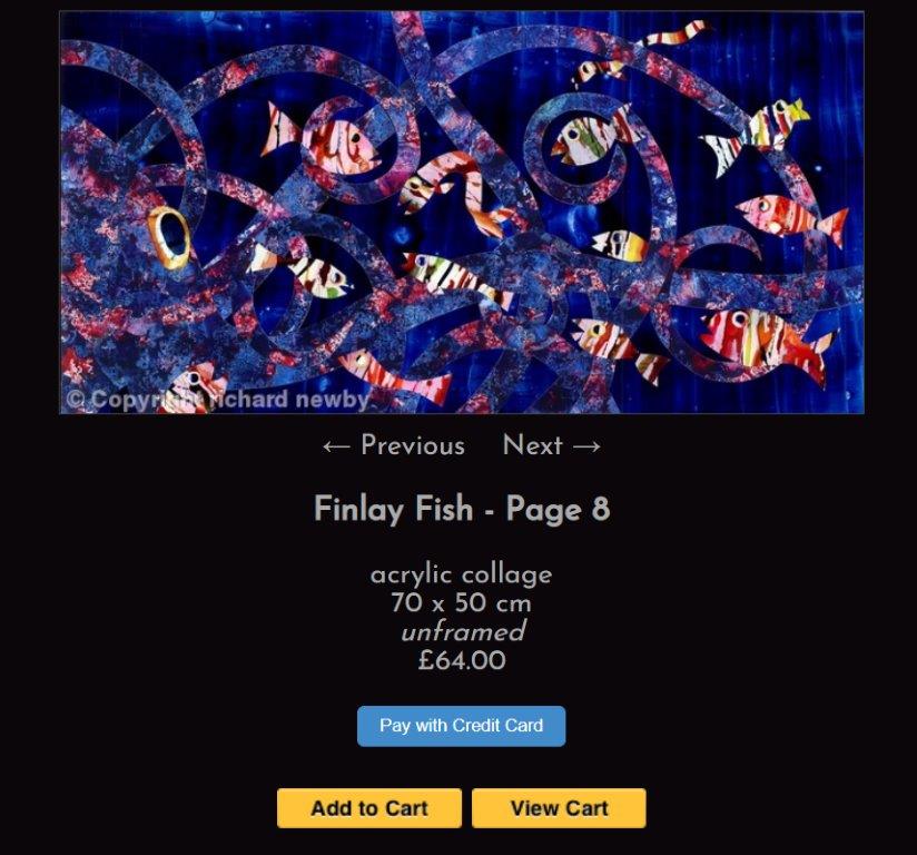
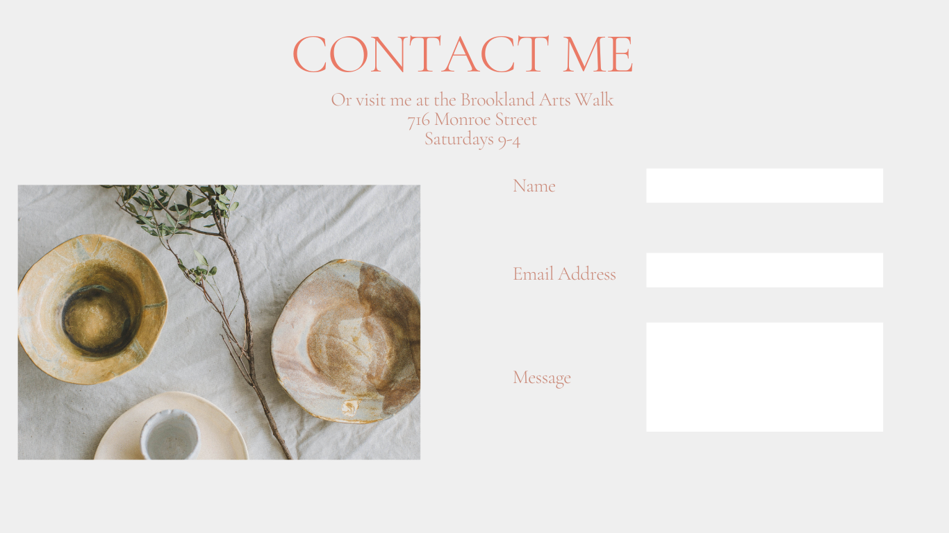
Do you make most of your art sales in-person or through an intermediary?
If you sell at a local boutique, through a gallery or in-person at a regular art market, make sure to include the operating hours, address and when customers can meet you directly. Whether or not your website has e-commerce capabilities, many art buyers still prefer to shop in person. Remember, you are your best sales rep.
Are you willing to take calls?
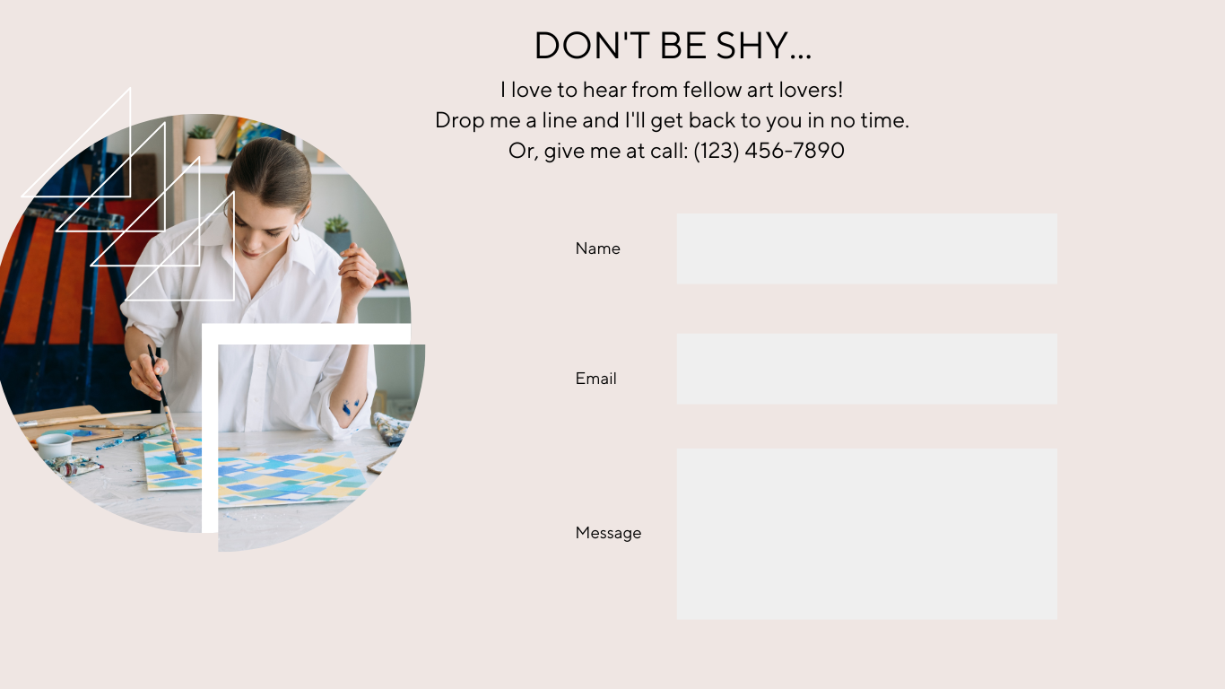
Certainly, the more means of contact you offer, the easier it is for prospective customers to get in touch. Indeed, some people shrink from a website contact form, convinced their question will be lost in the black hole of the internet. Like an email address, you want to weigh the pros and cons before publishing your phone number on your website. Who wants a voicemail box full of spam?
Alternatively, you can get a second phone number for free exclusively for your art business. With many providers, such as Google Voice, you can even set parameters for when it rings and when it goes to voicemail. That might help you avoid a late-night sales call. Just be sure to create a professional voice message, and state your art business hours and how long you typically take to respond.
Of course, if you don’t opt for a phone number, you can allay the concerns of art lovers allergic to contact forms. Be genuine, light-hearted or reassuring:
- “Get in touch! I love talking to fellow art enthusiasts.”
- “Drop me a line. I’ll be back to you in no time (I promise!).”
- “Let’s get the conversation started. Tell me a little about yourself and how I can help.”
Checklist for Your Artist Contact Page
As an artist, your Contact Me page is an often-overlooked but powerful engine for your art business. When building your form, consider incorporating some or all of these elements:
- Contact form that requests name, email, and a message box
- A pop-up box that appears after the visitor enters their message
- Image that tells the story of you, your art or the action you want the visitor to take
- A headline and brief but memorable copy that urges the visitor to take action
- Your phone number, address, email
- Social Media feeds
- A subscribe button for your newsletter
Creating a Beautiful Artist Website Doesn’t Have to be Hard
An added bonus of that contact page? The customers you gather are all your own. Unlike second-seller sites like Etsy, where you share space with hundreds of other painters, sculptors and makers, your artist website belongs only to you.
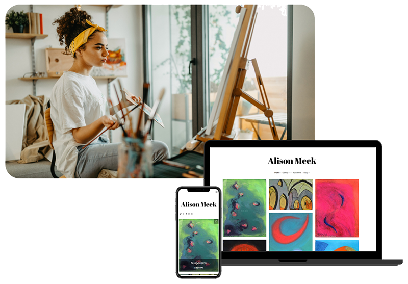
If you’re wondering how to build a contact page like the ones above, consider building a free website with Artweb. We make it super easy to create your very own artist website with just a few clicks.

