A few months ago we wrote an article about how important the idea of branding is for artists. We talked about building an identity, sharing the stories behind your work, and gaining publicity through various sources. For this article we’ve found some fantastic ArtWeb artists, all of whom are utilising these ideas successfully… get ready to be inspired!
1. Andre Leonard: http://www.andreleonard.com/
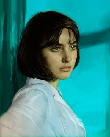
Andre has an instantly recognisable style, with a strong focus on portraiture and figurative painting. His homepage instantly displays his main areas of paintings, drawings, and illustrations, with a concise yet descriptive paragraph about his work, next to one of his standout pieces. This engages the viewer immediately, and encourages us to take a look through is diverse portfolio of work. He has set up a specific ‘Print Sales’ gallery, enabling visitors the instant ability to browse available work.
‘Girl in Blue and Green’ from Andre’s homepage
2. Carmen Gracia RE: http://carmengracia.artweb.com/
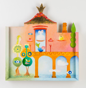
When we saw Carmen’s homepage, we were instantly hit with a sense of creative coherence and a distinct consideration of imagery. As individual works, each piece involves bold colour and a feeling of freedom, and collectively they come across as positive, uplifting, and full of life. We love how Carmen has included very early works from her career, such as ‘1950s watercolours’ and ‘early oil paintings 1955-59’, which give us a sense of the breadth of experience within her diverse portfolio.
‘Oil on Wood’ – a recent work by Carmen Gracia
3. Lou Draws: http://www.loudraws.co.uk/
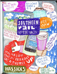
Illustrator Lou has a wonderful approach to her brand, with the personal, friendly (and relevant!) domain name ‘Lou Draws’. We are instantly greeted by some great copy – ‘this website is a window into my world’, which gives us an idea of the personality behind her work. Her playful and colourful works are separated into interesting categories such as ‘postcards’ and ‘Pinterest project’, with each having a little description about the collection of works. We love how Lou has included a sketchbook section, as it gives a fantastic glimpse into the thought processes of the artist.
‘Southern Rail’ – one of Lou’s sketchbook pages
4. Becky Crow: http://www.beckycrow.co.uk/
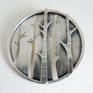
The first thing we thought about jewellery maker Becky’s website (apart from her designs being beautiful!) was that the concept is extremely clear. Right from the word go, her site title of ‘contemporary illustrative jewellery’ combined with her selection of home page images gives us an immediate understanding of her style and medium. She has an excellent biography and makes it very easy to find information about ordering, or where to find her work.
‘Birch Forest Brooch’ by Becky Crow
5. Kym Haverson: http://www.kymhaverson.co.uk/
Kym works as an artist, art director, and graphic designer, and her work is presented in such a way that each element of her practice complements and informs the other. Her commercial work is collated on one side of her page, instantly showcasing her impressive list of clients and collaborators. Her personal work is separately categorised on the other side of her homepage, with each gallery containing a descriptive text that gives us a background to her ideas and process.
‘Cluster’ – one of Kym’s paintings
6. Christine Wilkinson: http://www.christinewilkinson.co.uk/
As a multi-disciplinary artist, we love how Christine introduces her site as ‘film, pencils, and pixels’, a creative way of describing her photographic and digital art practice. Across all media however exists a distinctive abstract style, from purely digital creations to photographic double exposures and manipulations. Her ‘about’ page perhaps translates this most adequately as ‘form out of light‘. It’s also interesting to see how Christine has applied her works to alternative outlets such as ceramics, book covers and magazine designs, all of which are showcased on her site.
From a series of double exposures ‘Black currants’ by Christine Wilkinson
7. Weef: http://www.weef.co.uk/
First things first, Weef is a brilliant artist name – it’s short, memorable, and completely unique. As an illustrator, Weef ensures we are instantly drawn in with a distinctive custom logo as the header image to his site, under which we can browse his eclectic portfolio. Weef has worked with some impressive clients such as the London Evening Standard, The Times and the Telegraph. These galleries appear at the top of his page and give potential new clients an immediate sense of his commercial appeal, which is clearly down to his bold, individual style and distinct sense of humour…
One of Weef’s illustrations for the Evening Standard
8. Richard Whadcock: http://www.richardwhadcock.com/
Here’s another talented artist with a distinct and recognisable style of painting. Richard’s emotive, atmospheric scenes portray haunting misty landscapes and seascapes, utilising muted colour schemes and a method of obscuring and revealing that seems specific to him alone. Richard is represented by galleries in both London and Brighton, and his website includes important sections such as reviews, testimonials and his exhibition history, all of which showcase his successful career to date.
‘Sorrow Fell’ – one of Richard Whadcock’s paintings
So there you have it, 8 artists who are all representing their art practices in unique and clever ways. One interesting point to make it that when we first come across artists like this, we aren’t really conscious of their branding as such, in the strictest sense of the word. We are however struck by a sense of coherence and consideration, of high quality and individual style. And this is the point we want to make – that there are exciting ways of presenting your art that enable new visitors to get you in a few seconds, to understand the artist behind the art, and to experience your work in its best possible light.

