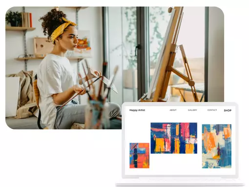
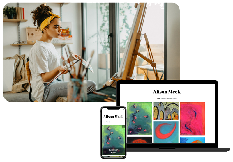
An artist homepage is your shop window. Just like an eye-catching display that turns window shoppers into buyers, your homepage should make the casual browser stop and think “WOW!”
But designing a stunning homepage can be intimidating. You’re an artist, not a web developer. Who has the time or budget to learn the ins and outs of web design, copy, graphics, and branding? And an artist website has its own specific requirements, so one-size-fits-all templates designed for other small businesses aren’t a great fit.
Fortunately, there’s no need to anguish over font choices or layouts, or spending time shoehorning your art into a generic website builder. Building a homepage that showcases and sells your art doesn’t have to be expensive or time-consuming.
At Artweb, we’ve helped more than 66,000 artists build the website of their dreams. Along the way, we’ve learned the secret ingredients of a beautiful homepage that serves as your 24/7 sales rep.
Read on to discover how to create an artist homepage with that wow factor.
The Basic Ingredients of an Artist Homepage
There are three must-have elements to your homepage. The image (or images), the text and the navigation. Plus, there are the “nice to have” elements that take your homepage from meh to wow: a Call to Action (CTA) and testimonials. Finally, there is the technical element — accessibility — that makes your site available to all visitors.
But it’s not enough to assemble your ingredients. To create a stunning overall impression, you need to deploy your skills as a visual artist to ensure each element complements and contributes to the whole.
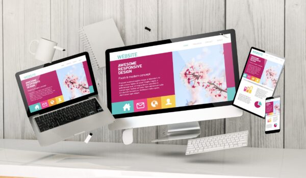
2 Things to do Before You Start Building Your Artist Homepage
That harmony of elements is where branding and web design come into play. Before you sit down to write a catchy headline, or curate the most beautiful photos of your art, you need to make two important choices: your brand and your website tools. Think of them as the what and the how of your website.
What story does my homepage tell about me as an artist? That’s your brand.
How will I build my homepage? That’s your website builder and templates.
Before Your Homepage: Design an Artist Brand
If a picture is worth a thousand words, then a brand is like a book of short stories. Every color, font, headline and logo you choose contributes to the feeling and impression your brand conveys. So, before you start designing a homepage, ask yourself:
- What are your values? What do you want to express through your art? What drives you to create?
- What makes your art unique?
- What adjectives would someone use to describe you as an artist?
- Who is your ideal customer and what do they like?
In addition to black and white, deploy a few colors to add pizzaz to your site. Your homepage colors should include the colors in your logo, but you may also include several complementary colors. Don’t go overboard with a dozen colors — on a website, a dash of color has more impact than a rainbow.
While a great artist statement serves many purposes, you can use it as the building blocks
A great artist statement should answer these questions and serve as the building blocks for a visual brand.
Let’s consider three critical components of your brand that need to be in place before you can create your artist homepage: color, logo and font
Colors
“I found I could say things with color and shapes that I couldn’t say any other way,” observed Georgia O’Keeffe. Indeed, the color scheme you chose allows you to wordlessly convey your values and style as an artist. Primary colors feel dynamic, while neutral tones feel soothing. On your homepage, where visitors rarely linger for more than a minute, the efficiency of color are paramount.
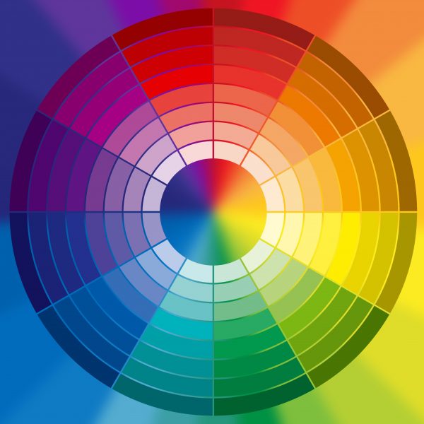
In general, you should opt for no more than two or three brand colors. Even if your art is a symphony of colors, your brand should not be. In fact, using a single brand color on your homepage draws your visitor to exactly the things you want them to see: a Buy Now button, for example.
As a visual artist, you will undoubtedly have definite ideas of color combinations. But what looks beautiful on a canvas may not translate onto a website. Pink is hard to read, while brown looks lifeless and fails to pop next to black text.
If you’re looking for inspiration, there’s no shortage of online resources on how to choose a brand color scheme.
Alternatively, Canva and other free graphic design software offer ready-made color palettes to inspire you. Or you can simply look to your trusty color wheel to choose complementary or contrasting colors.
Artist Logo
If your homepage is your shop window, then your logo is the symbol that represents your brand. It provides consistency and reassurance across your marketing channels — from your website and social media accounts to brochures and business cards. It tells art lovers: you’re in the right place.

Fortunately, you don’t need a marketing budget to create a memorable logo. Nike paid a student $35 for one of the most recognizable logos on the planet. Today, graphic design websites offer free templates awaiting your inspiration (you can register for a paid account to unlock extras, but you don’t need to). Indeed, a search for “artist logo” on Canva returned hundreds of templates.

While you should avoid cutesy readymade icons, don’t worry about riffing on a logo template. Once you add your name and brand colors or change the font, you’ve created a unique permutation unlikely to be repeated elsewhere.
Font
A font should be simple, and make text easy to read. In general, you should always chose a san serif font for your text and main headlines. With their ornate squiggles and old-fashioned curlicues, serif fonts can be harder to read on a mobile screen, and present challenges for visually impaired readers.
As with your color scheme, opt for no more than two fonts on your homepage: one for text and one for headlines. A bevy of fonts confuses your visitor.

In small doses, you can use a font with personality. For your signature or name, try a font that resembles handwriting or graffiti. Or add a single (short) headline using a font that captures the character of your art. Fonts can be whimsical or somber, modern or traditional, they can evoke 80s video games or fin de siecle Paris. It’s amazing what you can convey with the judicious use of a well-chosen font.

That said, for the majority of your homepage copy, the best font should be almost invisible. To misquote Coco Chanel, “Use a bad front and the viewer notices the font. Use a good one, and the viewer notices the content.”
TIP: Not everyone will start on your home page – unless they have clicked a link onto your site. Make sure you include strong and identical branding on every page.
Before Your Homepage: Choose Your Website Template
In addition to a clear artistic brand, you also need to decide HOW you’ll design that eye-catching homepage of yours. Sure, you could hire a web designer to create your site for you. But it will cost you thousands of dollars, and take weeks to complete. Surprisingly, for all the hassle, the result might be feel generic and uninspired. That’s because no one knows your art, your brand, your vision and your voice better than you.
Fortunately, website builders make it easy to design your own artist website. For example, Artweb offers ready-made templates designed specifically for artists. You simply choose the homepage style you prefer, select your brand colors and fonts, upload images of your art, and your homepage is ready in minutes.
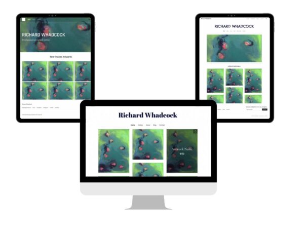
In general, you can choose between three basic structures for your artist homepage:
- A banner photo and headline above a gallery of small, equally-sized photos
- A headline (e.g. your name and perhaps a tagline) without a banner photo, above images of varied shapes and sizes
- A single image that fills the entire homepage, layered below a headline and text
As with your logo, you don’t need to worry that using a template yields a cookie-cutter homepage. Your homepage is simply the backdrop for your art, not the main event. Thanks to the time you invested creating a unique brand, your homepage will be as singular as your work.
Accessibility
When selecting a website builder, consider ease of use for people with accessibility issues. Search engines favor sites with built-in accessibility, so it’s both good business and just plain the right thing to do.
Before you start building your homepage, ask yourself how easy it is to navigate. When you choose colors and fonts, consider whether the text is easy to read. Uploading image, is the Alt Text box describing the image for those who cannot see it?
You can put a site through a Free Web Accessibility Checker programs that score your site on accessibility. Fortunately, many website builders, including Artweb, design their templates for optimal accessibility. For example, Artweb will flag for you when images don’t have Alt Text, which is how screen reader software describes content to a person with visual impairment.
Time to Work on the 4 Elements of Your Artist Homepage
With your artistic brand and website structure in place, you’ll find that building the homepage itself is relatively straightforward.
#1: Images
Unsurprisingly, an artist’s homepage should be heavy on images. Most images will feature your art, but you may also opt to include a photo of you at work. The homepage template you choose will determine the number, size and layout of your images, so think carefully about how the format that will showcase your work most effectively.
Here’s a few options to consider.
Single image
Featuring a single piece of art that exemplifies your overall body of work can make a dramatic statement. If your art focuses on texture or detail, you might even opt for a close-up detail, rather than the entire work. Don’t be scared to use an image that takes up the WHOLE screen. The “picture is worth a thousand words” truism is never more apt than with an artist’s homepage. With a high-impact image, you might only need to add a few simple words that summarize your art, as well as your logo.
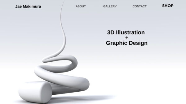
Single image checklist:
Before you go the dramatic route with a single image, ask yourself:
- Does the image load immediately?
- Does it stand out?
- Can you overlay text on it?
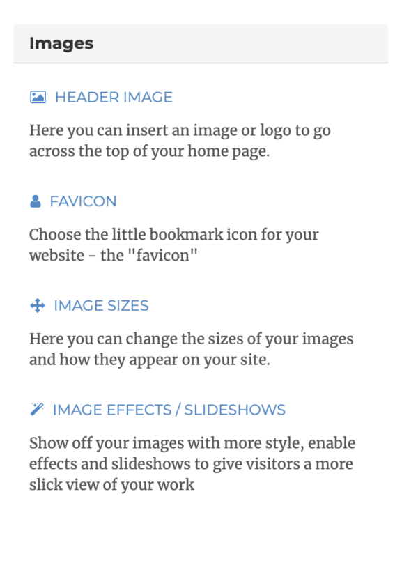
Moreover, just because you choose a single image doesn’t mean your homepage needs to feel static. For example, in Artweb, you can choose from image animation that makes the image fade in or the logo drop onto the image from the top of the screen.
Close-ups or details work really well. But when opting for the single-image homepage, your photography needs to be impeccable.
For the perfect homepage image, check out our guide on how to DIY your way to professional photographs of your art.
TIP: Avoid using an image that sits in a frame or on a wall. The white space of a computer screen already provides a frame.
Carousel images
With a carousel, images move across the screen in a timed sequence. For artists, a carousel feature allows you to feature more images of your art without cluttering your homepage with too many images at once.
Carousel images checklist:
- Ensure all images are the same size. Choose horizontal, portrait or square, and size them or crop them by pixels.
- Choose no more than five or six images. When the carousel shifts, it can be annoying to wait for the first image to come back around. So make sure images reappear within a few seconds.
- Timing. Many website builders let you choose how quickly the images change. Opt for no more than two seconds between shifts.
Gallery
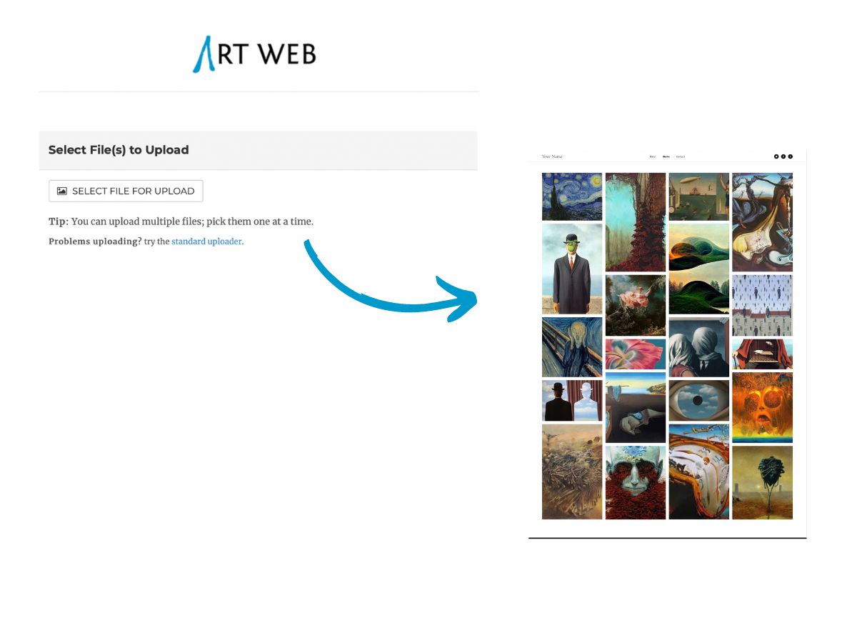
With a gallery style, you can create a grid of many images that can be seen at the same time. The advantage of this homepage format is that it helps your visitors grasp the breadth of your work in seconds. In that way, you don’t risk them bouncing off your website before they’ve seen a treasured piece.
Gallery image checklist:
- Ensure images are of equal size. Or, if you opt for a gallery with multiple image sizes, resize your images to fit neatly into the grid spaces.
- Ensure the images can be enlarged with a click.
- Create a link so clicking the image will open into its own page.
#2: What to write on your homepage
Your writing, like the rest of your brand, should match your personality and the style of your art. Is your style formal or informal? Serious or whimsical? Equally, consider your reader and the language and vocabulary that would build a connection to them.
Finally, you’ll need to decide whether to refer to yourself in the first person (I, me, my mine) or the third person (Carol or Burns). A first person style is more casual and may help your would-be customers identify with you as a person. On the other hand, galleries and art critics refer to their artists by surname, so if you’re positioning yourself at a higher price point, you might want to imitate that formal approach.
Make a choice and be consistent.
Header
Typically, a corporate website features a header or tagline that captures the company’s chief benefit to the customer, followed by one or two crisp sentences that describe the product or service. Fortunately, as an artist, you can forgo the quippy copywriting and let your art speak for itself.
Your header can be as simple as your name or a welcome message.
A Brief Description of Your Art
Below your name, a single line of text that introduces you may be a straight lift from your About Me page.
For better or worse, your About Me page (and not your homepage) is where you’ll need to exercise your writing muscles. If you’re looking for inspiration, read our tips for creating an About Me page that makes your art shine.
TIP: Avoid “Welcome to the site of artist Carol Burns.” Your top-of-page navigation should announce where they are. Instead add a detail. “Artist Carol Burns is inspired by her native Cornwall and the ocean that surrounds it.”
#3: Homepage Menu
Your menu is how visitors navigate your site. Think of it as the roadmap that guides them from your homepage to other pages. Clear directions and a simple menu are particularly important, because it’s unlikely that visitors will be ready to buy art based on your homepage alone.
In fact, research shows a strong correlation between time spent on your website and the likelihood of making a purchase. Understandably, your would-be art buyer wants to get to know you, learn about your background and view more of your art before they click buy.
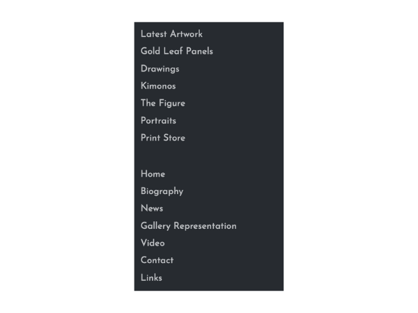
There are several ways to create a straightforward homepage menu. In general, a banner with tabs either runs across the top of your page or vertically down the left side. For each tab, use one (or at most two) words to describe each page. As a basic guide your menu bar should include:
- Home
- About Me
- Gallery/Shop
- Contact Me
- Blog (or Latest News)
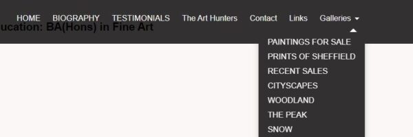
Keep our homepage navigation minimalist and uncrowded. If you have more pages you want to feature, use a drop down menu with sub-headings. Artweb makes these easy to create with a few clicks. For example, you may want to include multiple Gallery pages, organized according to genre, collection or by exhibit.
Call to Action
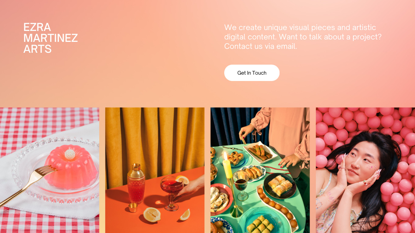
Finally, consider a pop of color and a Call to Action button to attract visitors to your most important page. If you sell artwork online via an e-commerce page, you’ll wan to send visitors directly there. If not, you may consider drawing their attention towards your Gallery or Contact Me page. Ask yourself what the next step is in making a sale or finding a new customer and guide visitors to that point.
#4: Testimonials
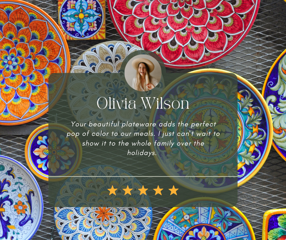
While testimonials are not an absolute must for your homepage, reviews from happy customers give you credibility and make future sales easier. They also add a human touch to your page and help visitors understand both the quality of art and customer experience they’ll enjoy when buying from you. And with a drag-and-drop website builder like Artweb, it’s easy to add a background image of your art, insert your customer’s rave reviews and make the testimonial uniquely yours.
Building an Eye-Catching Artist Homepage Doesn’t Have to be Hard (or Expensive)
If you follow these simple steps, you can DIY your way to a stunning artist homepage (and website).
And if you’re wondering where to showcase your fabulous homepage, consider building a free website with Artweb.

