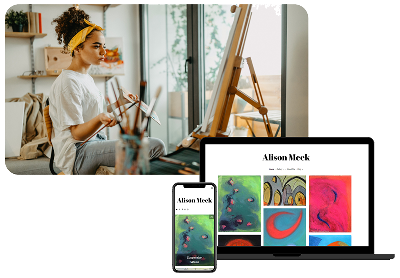
Wondering how you can improve your website with a few simple changes? Read on for our tips on how to address some of the most common mistakes…
1. SEO
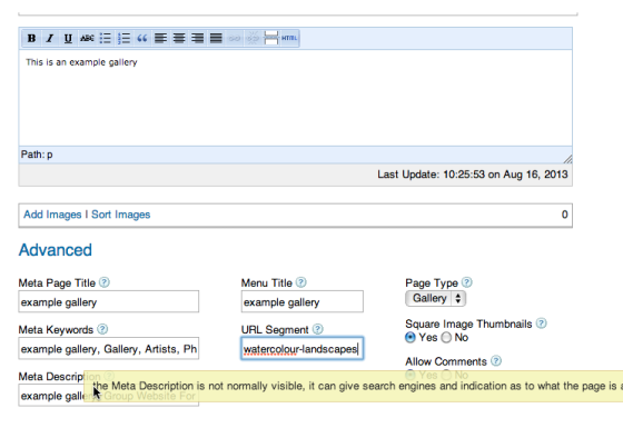
‘Search Engine Optimistation’ – it’s one of the most (if not the most) important elements in driving traffic to your website, yet so many miss out on utilising it. It may sound a bit confusing at first, but making sure your site is visible to search engines could make all the difference to how many sales you make. Here are some of the things you need to think about to make the most of your site’s visibility when adding content and pages:
- Alt tags / image tags
- Descriptive URLs
- Meta descriptions
- Keywords
If you’ve never looked at SEO before, these terms may sound unfamiliar! Luckily we have a handy tutorial explaining all of these points, and how to put them into practice on ArtWeb specifically – Watch it here. So now you can implement effective SEO directly through your ArtWeb control panel… hurrah!
2. Update your biography and CV
It’s extremely important to keep your ‘about me’ information up-to-date. This includes both your CV (in chronological order), as well as your artist bio. Try and see your website fom the view point of a new visitor, someone who doesn’t know you, and who has never seen your work before. They browse your work, see some things they like, and then check out where they can see your work for real by looking at your bio page… only to find out you’ve have been inactive for the last 4 years! Of course, this might not be the case, but even if you’ve been uploading new work to your site regularly this may not be clear. Therefore, having an out of date CV can be misleading to potential customers. Even if you haven’t been taking part in exhibitions, you can list the projects you’ve been working on. Or, make sure you explain in your biography that you’ve been concentrating on making new work. You could even link to a blog, which is a more informal way of keeping people up to date with your activity. We looked at how keeping a blog can benefit your practice a while back – read the article here.
3. Spring clean old work
Ever heard the saying ‘if in doubt, leave out’? It goes without saying that as your practice develops, so will your style and creative abilities. Something that you made 2 years ago might be miles behind what you are making today. Of course, it always helps to show progress in your work, but it is worth checking back over past work every now and again and really thinking about how it represents you as an artist.
4. Make sure all work is priced
This is something we’ve mentioned a lot, but is worth saying again. If you intend to sell your work online, having a line saying ‘please enquire for prices’ just isn’t going to encourage sales. Have you ever been to a craft fair where nothing is priced, and you don’t really have time to ask the stall-holder how much something is, so you end up walking away? Well, it’s the same for online shoppers, except people are probably less patient! Pricing your work is vital in encouraging potential customers to part with their money. Not sure how to price your work? Check out our blog post from a while back on this exact topic here.
5. Add a rotating gallery of your best work on your home page
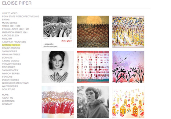
This is a nice idea if you haven’t made any new work in a while. Curate a mini exhibition on your homepage, featuring 5 or 6 of your best works. You can change these regularly, so it keeps your site feeling fresh with minimal effort. It’s a great way of instantly showing what you’re all about, rather than having a bit of an empty welcoming page. Eloise Piper (owner of one our recent featured websites) has a wonderful example of this idea on her home page.
6. Organise your page titles / sections for easy navigation
We see a lot of websites that have pages with random or confusing titles. For example, ‘Beaches’, ‘old work’, ‘recent photography’, ‘printmaking’, and ‘miscellaneous 2001 – 2009’. It doesn’t really give the visitor a comprehensive or clear understanding of how to find what they’re looking for. Decide on a theme for your sections. For example, if the landscape dictates certain periods or changes in your work, then by all means use ‘beaches’ as a relevant title… but the key is to keep it constant, e.g. ‘beaches’, ‘waterfalls’, ‘cottages’, ‘cities’. It will give your site a much more rounded and complete feel, and allow for logical navigation between projects.
7. Reduce image sizes to avoid frustrating loading times
Remember the days of dial-up Internet? That painfully slow step-by-step loading of images? Well thankfully these days most of us can avoid that, but even super-fast Broadband can’t make magic happen. If you upload high-resolution images to your website, you may find that visitors are reminded of the early 2000s when trying to view your artwork. As well as not providing a satisfying user experience, it’s actually detrimental to your search results. Believe it or not, Google prioritise fast, optimised websites in their listings, so having a sluggish site will inevitably leave you further down the rankings!
8. Make sure all links are links
Sounds silly, but we come across a lot of links within text that aren’t actually linked. Of course, people can always copy and paste into their browser, but a lot of the time this won’t happen. Don’t waste the opportunity to guide people to more of your work by missing this simple improvement!
Putting these tips into practice will ensure your site is at its optimum. Your website is more often than not the first place people will look to find more of your work, so it’s imperative that it looks great. Keeping it in perfect operation will not only enhance your professional image, but allow more important things to take centre stage, i.e. your art. So what are you waiting for… time to get cracking on those improvements!
If you’ve got any more tips you’d like to share with the ArtWeb community, please feel free to add your advice in the comments section below 🙂


