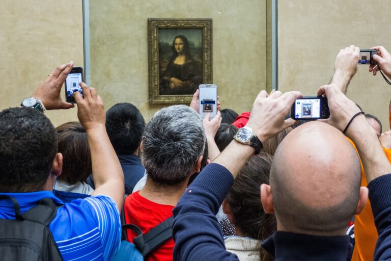
Every tube, train and tram in every city (…and town, village and hamlet) is stuffed full of commuters as they drag themselves to work each morning. The time of inside-pocket paperbacks and broadsheets has been replaced by tablets and smart phones. I travel against the crowd, like a salmon fighting the current, out of the city and into the country every morning; all I see are eyes glued to glass screens and endless scrolling.
Aside from significantly shortening our attention spans and bulking up our thumb muscles, mobile devices have also changed the way we absorb information, view ourselves, and interact with others and the world past our ever-expanding screens. More than ever it’s become important to think about how your work is seen on a mobile phone when photographing your work.

The proof that the small screens matter
Last year Artsy, the online platform set up to support art collecting and education, surveyed the world’s leading Instagram-using art collectors. Granted, just chasing the Insta-elite is a small sample demographic; however, the fact that 51% of these collectors had bought work from artists that they discovered on Instagram is pretty impressive. Even more impressive was that these discoveries resulted in 5 or more purchases. So, it turns out that the Facebook-owned photo-sharing app is paving the way in post-gallery purchases.

Think about your audience. You’re online, they will be too!
We know that the internet is changing the way people buy art and we know that social media has a huge impact on communication, but these figures are outstanding. Just a few months ago, in The Atlantic magazine, one journalist asked if ‘gramability’ was changing the cultural landscape, if large-scale, immersive exhibitions were being programmed in order for that ever-important profile picture. Closer to home, The Southbank Centre’s Hayward Gallery has been playing on the ‘places to be seen’ ethos of immersive exhibitions for years – just think of Anthony Gormley’s ‘Bright Light’ or Martin Creed’s 2014 Half The Air in a Given Space (2006) installation. The (then) Unilever Turbine Hall commissions down river at Tate Modern have also played with this idea since their inception.

The 99% of artists can’t even dream of the scale at which these exhibitions function: the costs, time and space involved is huge. What is important to take from these gargantuan museum displays is, however, the small image. Your work could be lost with the flick of a thumb, a scroll to the next image on the next bus ride. Generation Tinder, the kind of gallery-going audience who might one day think about furnishing their ‘help to buy’ bedrooms with fine pieces of art, function within a mindset that views everything small before going big. Recommendations for films and shows, who to date, what to read, how to travel and even where to walk all filter from the smaller screen to the bigger picture.

Small things you can do
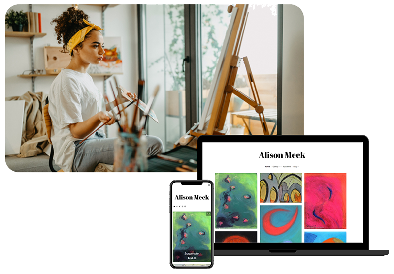
When photographing your work, uploading it to Facebook, or just adding it to a gallery on your website, it is important to consider how the commuter will see it. Small screens, for all their pinch action zoom capabilities, do not show detail to the same degree a computer monitor does. Think about taking macro shots of your work, focusing on a small section and emphasising detail. By doing this you have taken away the need to pinch and pull and zoom and if you can grab someone’s attention within 5 seconds of them seeing your work you might have made a new fan. If you can’t, you have definitely lost your opportunity to.
Tina Mammoser’s small works (see photo above) are charming and the imagery is striking without requiring too much (if any) additional reading to understand it. When an artwork strikes you from a phone screen, you can imagine the image staying there when you lock your phone and you want it as a screensaver. This is what Tina’s work does through its artful exhibition of its media.


