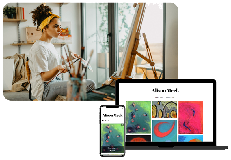
Welcome back to our ‘Getting the most out of your website’ series! In Part 2 we are focussing on ‘Making it Clear’ – covering all aspects of getting your message across to your site’s visitors, and hopefully encouraging them to buy your work! This is aimed predominantly at artists who are hoping to sell work through their websites, rather than through exhibiting or through galleries.
1. Price your work
- Pricing your work is an important element to your website. Many artists don’t include specific prices, but visitors will feel a lot more keen to buy an artwork if the price is there in front of them, rather than having the extra process of contacting the artist.
- Pricing your work can be tricky! Knowing the best price to specify can take a bit of time to work out. Think about how many hours it took you, the cost of raw materials and the realistic profit you want to make. It is also important to consider other artists working in a similar genre, at a similar level. There is a lot of info out there to give you some extra advice. We have an in depth article on ‘pricing your artwork’ here, just one section of our 5-part Art and Money series.
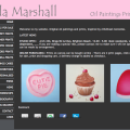
- Here’s an example from Artweb member Karen Simmons’ website:
As you can see, Karen has clearly marked her work with the price, and has made sure her customers know that this is an unframed work. If you visit Karen’s website at http://www.karensimmons.co.uk/ you’ll see that she has also sectioned her work into ‘Work for Sale’ and ‘Work sold’ sections, to make things extra clear!
2. Details about your work
- Include as much as possible! The computer screen can be deceiving, and although you know your work, people visiting your site will be coming with fresh eyes. Make sure you include things such as size, framing options, media and any other details that might be confusing to customers.
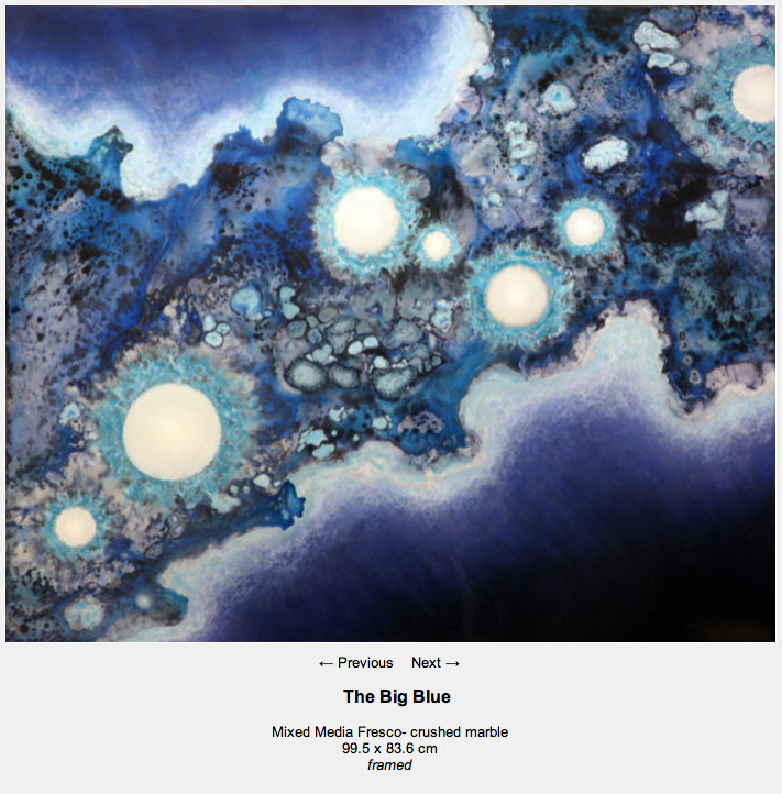
- A great example of this is Artweb member Adam Arbeid, who uses a number of materials to create his beautiful work:
For this image he has clearly stated the media, size and framing. See more of his work at http://www.adamarbeid.com/
3. Make it clear – T+Cs
- It’s the boring bit, but essential that you have some solid Terms and Conditions in place. It’s beneficial to both you and the customer, and will also mean you are not constantly answering emails from potential buyers.
- Your terms of sale should include things such as shipping rates, resale rights, and return options.
Here are some examples of artists with informative T+C sections that cover everything:
- http://www.wendy-puerto.co.uk/terms–conditions
- http://www.ewood-art.co.uk/payment-and-delivery
- http://www.eliseferguson.co.uk/how-to-buy
- You can also create your own Terms and Conditions on your Artweb profile, and then copy them over to your website. Artweb has an automatic generator to make it easy to put what you want into official jargon! Find it here: http://www.artweb.com/myaccount/mydetails/editbuyerinfo
- Also ensure that within your T+Cs you clearly state your copyright. Here is an example: http://www.ptfrench.co.uk/copyright
4. Good Images
- Good photographs or scans of your work can make or break a sale! It’s a shame but a lot of brilliant work can often be let down by a blurry, out of focus, dark or overexposed image.
- You don’t need the latest digital camera to get great photographs. The best and simplest way to make sure you get good, even light, is to go outside on a dry, overcast day. Bright sunlight will give you harsh shadows and burnt out areas, whereas the cloud acts as an enormous soft-box and will mean perfect, even light. Lay your work on the ground, on a larger sheet, and photograph from overhead. This is best for smaller works – larger might mean you struggle to get far enough away!
- Make sure you are directly overhead to avoid skewing the image.
- Shoot as high quality as your camera will allow, and scale down later.
- For larger work, find a blank wall and either lean or hang your work, always ensuring it is in a space with even and consistent light.
- Sculptural work may require a bit more thinking through. Scale can be particularly deceiving, so ensure this is not misleading your viewers.
- It is up to you whether you need to give an idea of scale. It might be good to include a hint of location around the artwork, or the frame that it comes in etc. Some artists might find this distracting – if so, make sure you clearly state the sizing next to the image.
- Scanning is also a great and easy option for smaller, 2D works. See out page on scanning tips if you need help: http://www.theartistsweb.net/wiki/How_To_Scan_Artwork
- Make sure you prepare your images for the web. If you have ever noticed that your images seem faded, washed out or just a different colour altogether when you upload them to your site, it may be because they are not set to the right colour profile. For more info on this, there are lots of helpful articles online. We found a couple here, and here. Use photoshop (or similar program), use auto levels to brighten and add contrast, or you can also tweak them yourself to your desired effect. Use adobe RGB colour profile
So, as long as you follow a few simple rules, you will have great pictures on your website!
Here are some examples of good images from a few Artweb members’ sites:
– Biota by Duncan Bell- great example of showing sculpture in it’s site-specific environment, and helps the viewer understand scale!
http://www.duncanbellsculpture.com/
– Clear, bright and beautiful! Kim Glass’ ‘London Twitter (detail)’
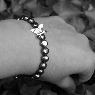
– Wendy Kemp uses artistic photography to emphasise her jewellery and uses models to let us know the size and shape of the items in context:
http://www.wendykempjewellery.co.uk/
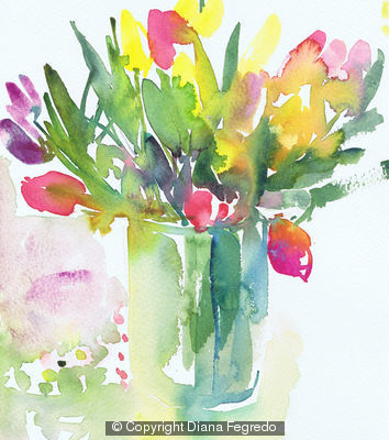
– Diana Fegredo’s delicate watercolours are shown off to their full potential in these bright and colourful images:
http://www.greenartgirl.co.uk/gallery
So that’s it for this month! Hope you have found this article useful, and if you’re stuck for inspiration just have look at the hundreds of brilliant sites by Artweb users. In Part 3 next month, we will be looking at the best ways to publicise your website and get your work out there. We’ll be sending it out on the 17th October… see you then!

