Group shows, design and open-call exhibitions: as a designer or non-traditional artist you should consider every opportunity as another audience and an untapped point of sale. Using examples, this post looks at how the display of your work makes all the difference in the eye of the beholder.
Make every submission you can and be fearless: this is the only way to be seen. Any creative practitioner has the scope to be included in group shows and get their work in the face of the money-spending, art world cronies. LINES took place two years ago next week at the Strand Gallery, and mixed the high and low, the fine and the artisan. With a selection of artists from across the spectrum of artistic disciplines every artist had two parallel aims: to communicate their artistic sensibility and to sell work.

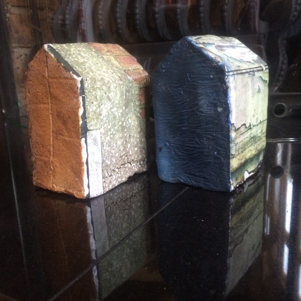
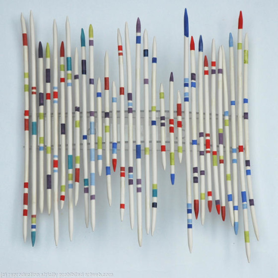
Exhibited to complement each other, the works of Joanne Barlow and Maria Christoforatou not only shared similar aesthetics but also explored similar themes despite the fact that Joanne worked as a ceramicist and Maria as a collagist.
All great art is about communication so it shouldn’t matter how you say it, whether it is through ceramics, woodwork, printmaking or fashion. When placed in the right setting any work takes on the value of its surroundings…and this was the key success of LINES and something any practitioner can take on board when scrolling through the endless lists of open calls. Consider the themes of the specific show and how your work could fit the brief; base your website, no matter the content, on art models; write a good artist statement based around your broad influences; and have a broad visual portfolio. The highest sales during LINES were among ceramicists and designers. Within the right framework a potential buyer will think about the money they’re spending on a new artwork—it doesn’t matter if this is a canvas or plate! What this varied selection of artists does is re-contextualises the objects on display—it posits them firmly as artworks in the minds of the viewer and lets them think about how they, themselves, would place it in their house. The transition from institution to domesticity is much easier with these objects.
Paths of critical enquiry stitched in fabric and or hardened and glazed can find their way into the white cube—with a push and a shove from you. Variety may be the spice of life, but it also seems to be the flavour of the month. Sonia Delaunay’s latest retrospective at the Tate Modern is a great example of how a single show can incorporate so many artistic tangents so successfully. Walls of fabrics in such an esteemed museum—and one focused on art, no less—is proof that the doors are very much open to all.
Diane Griffin is the perfect example of an artist who can navigate the awkward, and often confusing, terrain of art and craft. Her mix of function and display is well played and completely balanced within her practice; and on top of everything else it looks great, regardless of where it is.


