Welcome to our latest article, ‘Getting the Most Out of Your Website Part 4: Design’.
This is the last article in this series, and will focus on how you can develop your own individual website design, without going over the top and without having to know lots of fancy coding! A lot of you will be using Artweb’s templates, so we will be referencing some of the provided tools within this article. If you are thinking about designing your own artist’s site and haven’t tried Artweb’s website builder, it’s a great place to start!
1. Easy Navigation
As artists, it may be easy to get carried away when you first start building your site. After all, it is a technical version of a blank canvas! Creativity and experimentation are great for your artwork, however simplicity and keeping things obvious is key to a successful website design. Here are a few simple tips regarding navigation and menus:
- Your menu should be arranged in either a straight column on either side of the page, or as a bar along the top. Artweb’s templates already featured these menu options, so the hard part is done for you! Here’s an example of top menu bar, put into practice by artist Yvonne Ayoub: http://www.yvonne-ayoub.com/
- …. And here is an example of side menus, used by painter and printmaker Sharifa Brooks Read http://www.sharifabrooksread.co.uk/
- Avoid the temptation to be too cryptic! Potential buyers might be put off by long headings that describe in-depth processes before they’ve even seen the work. If you want to include processes and the background to your ideas, this could be done as a caption once they have already clicked on the artwork. That way, they are drawn in by the visual impact of the work.
- Equally, avoid being unspecific. A section on your website that has some of your best work in it is not going to be well represented by the heading ‘misc’ or ‘other work’.
- Try to avoid colours that are too close where text is. For example, don’t use yellow text on orange menus, or purple on pink etc. The classic black on white is ideal!
2. Get straight to it!
- You may have seen websites with fancy ‘splash’ pages. These can often put people off, especially if they include a lengthy animation that can’t be skipped through! Make sure your homepage is your landing page, and that it clearly shows the menu with all the sections.
- If you want, you can still create impact on your home page by displaying a large image of your most recent/successful artwork, or having a film or animation playing. However, make sure all the links are visible too so they can navigate easily from the homepage.
- Here are some great Home Page examples:
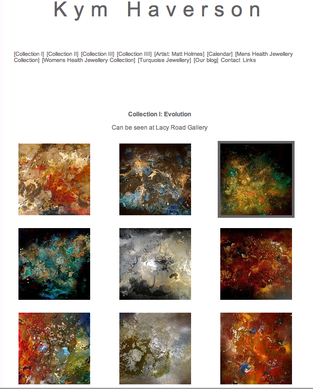
- Painter Kym Haverson lets her work do the talking with her simple, clean homepage: http://www.kymhaverson.co.uk/:
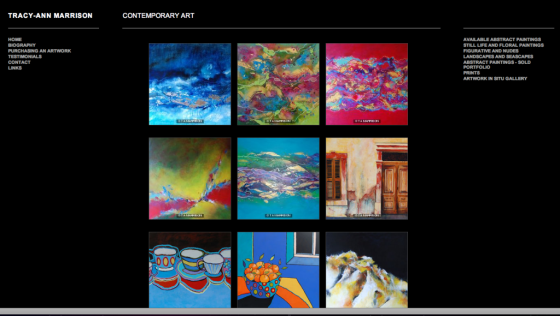
- Tracey Ann Marrison uses 2 sidebars on either side of the page. On the left are all the sections to do with info, while on the right you can find her artwork categories. She has kept her text and name a modest size, which allows her featured artwork to really stand out: http://www.tracyannmarrison.co.uk/:
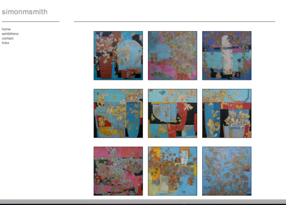
- Again, simplicity is key for Simon M Smith: http://www.simonmsmith.co.uk/:
3. Colour scheme
- Keep to a colour scheme that compliments your work!
- If in doubt, stick to white, blacks and greys. As tempting as it is to use your website as a paint pallet, try and think about how this comes across to visitors!
- In most cases, your artwork provides the colour, and shouldn’t be competing with your background colour (see the successful examples by Kym Haverson and Simon M Smith above)
- In some cases, vibrant colours can be used… if they suit the work! See examples below:
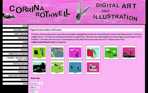
- Illustrator Corrina Rothwell, who was our featured website a few weeks back, is an excellent example of this. She uses vibrant pinks and contrasting black to set of her colourful and humorous art works: http://www.corrinarothwell.co.uk/:
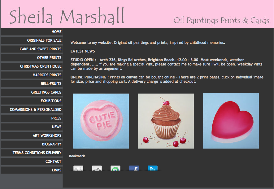
- Here’s another example of colour being used effectively. Sheila Marshall has complimented her confectionary-focused work with a subtle pop of pink! http://www.sheilamarshallartist.com/:
4. Fonts
- When choosing a font, stick to simple and clear typefaces such as Arial, Georgia, Tahoma or Times new Roman
- It’s personal preference, but sans-serif fonts such as Arial appear clearer and less fussy than serif fonts, such as Times New Roman
- Choose a font that suits your work best! In the 2 examples above (Corrina Rothwell and Sheila Marshall), both artists have used fonts that are clear and easy to read, but that reflect the character within their artwork.
That’s it for now! We hope these website examples and tips have helped inspire those of you who might be struggling with their website design. Remember there are so many great websites out there, get exploring and see what works and stands out for you!
We will be soon, as we are bringing next month’s newsletter forward to talk about all things Christmas! Got any tips for selling work at Christmas fairs? Know effective ways to market your work at Christmas? Why not share your ideas with other artists… let us know your thoughts here. See you soon!
OPPORTUNITY
Artist or Illustrator wanted for Album Cover
Sharon Lewis is a highly regarded songwriter and is looking for artists who may be interested in painting/illustrating a cover for her new CD titled Roses At The Top. See more info about Sharon here: http://www.sharonlewis.net/.
Sharon’s new album is quite a magical journey, with songs about longing, hope, loss, friendship and transformation. The inspiration behind Roses at the Top is of a spiritual journey in life, and the quest for self-knowledge and self-love. The emotional landscape of the song is a mountain that one is climbing, symbolising life’s trials, and the roses at the top symbolising enlightenment, contentment, peace.
The album is self produced and at present does not have financial backing, so Sharon is really looking for artists who feel inspired by the music and would like to contribute. However, all credits and links to artists would be noted on the cover. Please contact info@sharonlewis.net if you are interested. Below are links to some of Sharons songs for the new CD:
http://soundcloud.com/sharon-lewis/kings-and-queens
http://soundcloud.com/sharon-lewis/roses-at-the-top
http://soundcloud.com/sharon-lewis/birds-of-prey
Good luck!!

