Setting up your artist’s website
Welcome to this series of articles with tips on how to get the most out of your website.
In this first part, we’ll be looking at how you can build a first connection with your visitors by creating an ‘About Me’ section that really stands out and represents what you and your work are about!
We are going to go through a few of the important points and show you some examples of artists (including ArtWeb members of course!) who are really using their ‘About Me’ section to full advantage.
1. Artist Statement
Try and include a portrait of yourself! There are lots of reasons why this is really useful.
It helps visitors to your site connect with your statement and your work, and it’s also a chance to let some of your personality come through.
You don’t have to have a generic passport photo. Why not think about how you can channel your creativity through your picture?
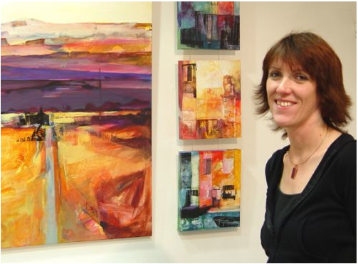
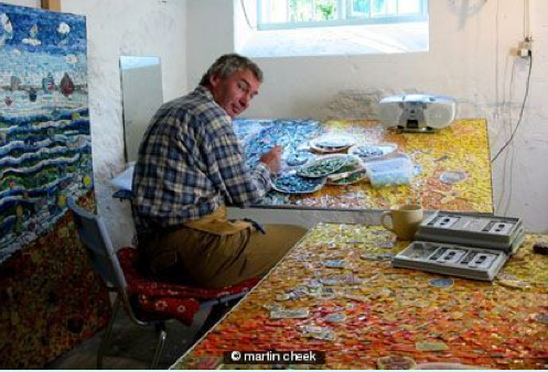
A great idea is to to have someone photograph you next to or amongst your artwork. This create instant credibility and shows you’re passionate about your work.
Below are a couple of artists that I think do this well:
ArtWeb member Martin Cheek has a great example on his site http://www.martincheek.co.uk/:
Another well done profile picture is that of Kate Boyce, http://www.kateboyce.co.uk/biography:
Some additional advice and examples for your profile text
- Try to convey the fundamental elements of what your work is about. Think about what it conveys and what ideas you tend to focus on.
- What materials and processes do you use and why?
- Try not to overcomplicate your statement with long theories or confusingly elaborate processes. Keep it concise and clear, and make sure it really is relevant to your work.
- What / who are your influences? How have these affected your work?
- The length of your statement can vary when applying for residencies, galleries etc., but for your website all you really need is a few well-written paragraphs that capture people’s attention. Here are a couple of good examples:
Mixed media artist Camilla Brendon uses her statement to introduce the themes and ideas behind her work: http://camillabrendon.com/statement.php
Collage artist, photographer and illustrator Julia Bellamy, an ArtWeb member, also has a short and sweet statement that sums up her practice and references her influences and inspiration: http://www.juliabellamy.co.uk/about-me
- Another great idea is to use a ‘strap-line’ or headline, if you want to sum up your practice in a few words:
Artweb member Anne Magill has decided to use a quote on her opening page. This is a really great idea as it gives a sense of professionalism, and shows the artist is successful: http://www.annemagill.com/
Artist David Shrigley, http://www.davidshrigley.com/, whose work is all about humorous combinations of text and images and implied meanings, has used the ideas within his work for his opening page. It’s successful because the strap-line is a work in itself!
2. Biography
- Your biography is a chance to boast! Many artists struggle with self-promotion and maybe feel uncomfortable about listing achievements and successes. However, we all know how important it is to sell yourself, especially when you are trying to sell your work at the end of the day!
- Focus on the parts of your life that you are most proud of. For example, if you feel you’ve had a great education and gained a lot out of it, write about this in a bit more detail.
- Include some information about where you grew up, your influences perhaps, where you moved to etc. Your biography is a chance to talk about YOU and not just your professional achievements (these can be listed in detail in a separate CV).
- Don’t be afraid to use humour!
- General things to cover are: your education, exhibitions of particular note, awards or shortlists (choose 1 or 2 important ones) any artist’s collectives you might be part of, future shows and commissions, and any part of your personal history that you feel is relevant. Here are some examples of successful biographies:
Joanna Yates has a great biography on her site, also a brilliant use of a profile pic that shows her working: http://www.joannayates.co.uk/about-me
Another excellent example is Leyla Murr who writes about herself with a great energy and enthusiasm that really reflects her work: http://www.leylamurr.com/biography
And here are some other great examples we find worth checking out:
http://www.eliseferguson.co.uk/biography
http://cecilrice.theartistsweb.co.uk/biography
3. Artist’s CV
- Your CV can act as an extension of your biography- an opportunity to list all of your achievements in detail.
- If you feel that you don’t want a CV on your website as well as a statement and biography, you can always include it as a link to a downloadable PDF. That way, people can choose whether they want to read it!
- It’s good to include your basic info at the top, such as full name, email address, phone number. Some artists include their date and place of birth, but this is entirely up to you!
- Include your education in date order, most recent first. If you have taken on further or higher education, it might not be necessary to include GCSEs and specific grades, unless you feel they are relevant to your work.
- List your exhibitions by year, for example:
2011
– Landscapes, The Artists Gallery, London
– Beautiful Creatures, Close Up Gallery, Herts
2010
– Seascapes, group show at The Other Gallery, Bournemouth
– Found structures, Hope Gallery, Ipswich
etc.
- You can also separate your exhibitions into Group shows and Solo shows, if you prefer.
- Include details of residencies or exchanges you have done.
- Make sure you put down awards and any you have been nominated or shortlisted for.
- Include a commissioned section, to list selected commissioned work.
- List any work that has been published in books, or any articles that have been written about you and include images of your work.
Here are some examples of a couple of Artist’s CVs, from artists at various stages in their careers:
http://www.siobhanohehir.com/biography
http://www.helenmasacz.com/exhibitions
That’s it for part 1, hope you enjoyed the article! If you have any examples of great ‘About Me’ sections why not post a link as a comment?
Part 2 will be focussing on ‘Making it Clear‘, covering advice on how to clearly communicate with your audience, as well as tips on pricing, sizing and taking photographs of your work.
See you soon!

